Well Miami got one thing right. Adidas changing name font

Adidas offered the school a boat load more money. They would have been crazy to turn them down. There are a few things I don't love about the new uniforms but all things considered they are nicer than the clown costumes Nike was designing for us. I'm just thankful we've seen the last of clams, orange and green helmets, rainbow numbers, and random chess king logos on the shoulder pads.
 
Advertisement
View attachment 31763

View attachment 31764

View attachment 31765

Good riddance to Nike, they brought us this garbage.

but ur cool w Adidas' version??? The green joints are from the 70's homie, so now u gotta problem with giving us a lid from back in the day? Dude, if u think that what we have now w/ Adidas is better than what we had w Nike over the years, then I gotta bridge to sale that would nicely in ur back yard.

Obviously, you haven't seen the 70's helmets. They look nothing like the garbage Nike did last year. Stop spinning facts to support your Nike agenda. Nike ruined the helmets as soon as they touched them. For Christ sakes, they put the Klam on the helmets and uniforms.
 
Last edited:
what doesnt'make a **** bit of sense to me is how ive heard more about the ****iing font than the **** bull**** helmets the last few years. nobody gave a **** about that atrocity but the font is making people jump out of a ******* building? gotta be honest. i dont get it
 
uniforms look like ****! numbers are too small, shiny accents on paints and feathers on sleeves are *** as **** too. They match our play at least

They looked like bargain bin, knock off Oregon unis.................................might as well have gone with LA Gear.
 
Advertisement
View attachment 31763

View attachment 31764

View attachment 31765

Good riddance to Nike, they brought us this garbage.

but ur cool w Adidas' version??? The green joints are from the 70's homie, so now u gotta problem with giving us a lid from back in the day? Dude, if u think that what we have now w/ Adidas is better than what we had w Nike over the years, then I gotta bridge to sale that would nicely in ur back yard.

We sucked in the 70s. Not a tradition any of us wants to recreate, although Golden has done it anyway.

Bro, u said messed with lids...and I'm saying we had a lid from the past, a current lid, a homage lid, and a concept lid. Was I in love with the concept joint, no...but I have no issues with a throwback joint, or a homage joint. Our jersey's remained traditional...except for the color combo (which u r seeing will be the case with Adidas as well)

none of those ****ing helmets were helmets from success past bro. they were in their own way a new concept. By your logic, and Iḿ ok with that, if we do a homage helmet from the past so be it then yeah I get what youre saying but thats not what we did. We made all new shiny ornament helmets with shades being slightly reminiscent of the past and ultimately being all new bull****. **** all that. no deal. not buying.

Fact...the bowling balls from last year sucked.

The classic true green helmets, and even the gold storm warning flag helmets as an occasional tribute is cool by me.

UM
 
View attachment 31763

View attachment 31764

View attachment 31765

Good riddance to Nike, they brought us this garbage.

but ur cool w Adidas' version??? The green joints are from the 70's homie, so now u gotta problem with giving us a lid from back in the day? Dude, if u think that what we have now w/ Adidas is better than what we had w Nike over the years, then I gotta bridge to sale that would nicely in ur back yard.

Obviously, you haven't seen the 70's helmets. They look nothing like the garbage Nike did last year. Stop spinning facts to support your Nike agenda. Nike ruined the helmets as soon as they touched them. For Christ sakes, they put the Klam on the helmets and uniforms.

lol...so let me ask you...what color were the 1970's helmets? Like some of you guys really don't get the concept of taking something from the PAST and putting an UPDATED touch on it.

Nike agenda? Am I getting paid by Nike? If I were, I wouldn't be here, trust me. I'm stating facts, facts that came from the Nike design group as to why they made the green helmets, and why they made the smoke helmets. I've already said the copper orange helmets was a concept look...a concept look that EVERY university is doing b/c at the end of the day, kids like new things.

My point is, our jerseys from last year still felt like Miami. Our jerseys from this year feels very JVish. Not in our TEAM'S HISTORY have we ever had stencil font or our school's name on the front of the jersey. Adidas said they were going to go back to our traditional look. That came out of their mouth, and they went EURO on us. That's a fact homie....not spinning a "Nike Agenda" as you mentioned. I was hoping they treated our jersey like they treated Michigan's jersey...that's all.
 
but ur cool w Adidas' version??? The green joints are from the 70's homie, so now u gotta problem with giving us a lid from back in the day? Dude, if u think that what we have now w/ Adidas is better than what we had w Nike over the years, then I gotta bridge to sale that would nicely in ur back yard.

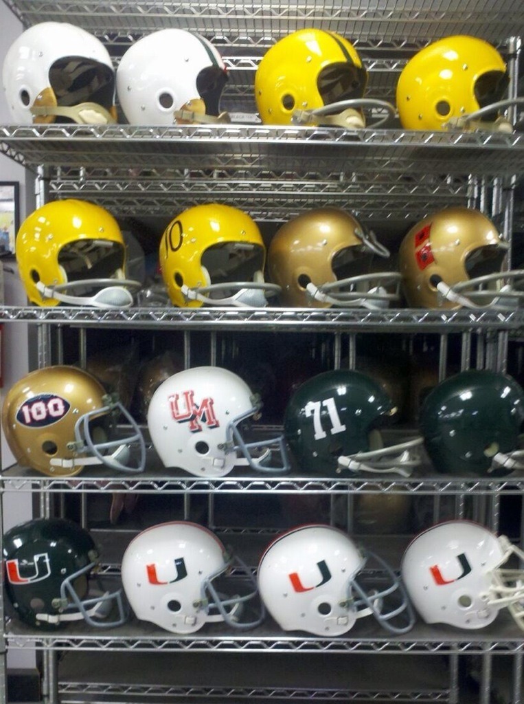
Those green Nike helmets from last year are NOTHING like what Miami wore in the 70s. See for yourself (complete Miami hlemet history, not just the green ones worn in the early 70s):

tumblr_mqm1op9wqh1qd3dzlo1_1280.jpg

I'm well aware of the Canes helmet history...trust me. My point was, we went to a green helmet as a throw back. The point was the green helmets weren't just randomly selected. the point was, nike took our green helmets and put a modern spin on it. how hard is that to comprehend. And for the record, if we are supposed to be Adidas' "Oregon" school, do you actually think under this 10 yr relationship that we are not going to have some wacky helmets on our head??
 
Advertisement
I like the stripes on the pants way better than the plain pants we had last few years. Looked like we were wearing pajamas. The shoulders could be better but they aren't terrible.
 
lol...so let me ask you...what color were the 1970's helmets? Like some of you guys really don't get the concept of taking something from the PAST and putting an UPDATED touch on it.

Nike agenda? Am I getting paid by Nike? If I were, I wouldn't be here, trust me. I'm stating facts, facts that came from the Nike design group as to why they made the green helmets, and why they made the smoke helmets. I've already said the copper orange helmets was a concept look...a concept look that EVERY university is doing b/c at the end of the day, kids like new things.

My point is, our jerseys from last year still felt like Miami. Our jerseys from this year feels very JVish. Not in our TEAM'S HISTORY have we ever had stencil font or our school's name on the front of the jersey. Adidas said they were going to go back to our traditional look. That came out of their mouth, and they went EURO on us. That's a fact homie....not spinning a "Nike Agenda" as you mentioned. I was hoping they treated our jersey like they treated Michigan's jersey...that's all.

You are not stating facts, you are stating how you feel. You even say that Miami's jerseys last year "felt" like Miami. However, the jerseys from last year look nothing like what would be considered a traditional Miami jersey, all you ahve to do is look at the pictures.

I get it, you are a fan of Nike and that is fine but don't go stating your personal opinions or feeling as facts.

So to be clear, you are saying the jersey's we have now are closer to the tradition than the jersey's we had last couple of years?
 
Advertisement
Nike made us look like FAMU last year at GT. **** Nike. **** was aweful.

No, Nike did not make us look like FAMU, Golden made us look like FAMU. Everyone keeps trying to blame Nike for the Green top/Orange bottom or Orange Top/Green bottoms combo. Guess what? Adidas had that same combo. Just like we just wore that stupid orange on orange combo...that has nothing to do w/ Adidas. Adidas don't say, "Hey Miami; wear this combo or else." That comes from the coaching style. And from that one combo, everyone said...oh look what NIKE had us in...when they should've said, look what Golden had us in. Don't blame Nike for the FAMU look, just like don't blame Adidas for the same FAMU look when we rock it soon.
 
people calling for Nike back have short memories.. They were good up to 2013.. 2014 was a disaster. Looked like FAMU.. The feather look is pretty lame.

Funny thing is that Miami has simple uniforms to get right. Just don't try too hard and they will be tight.. but noooooo have to have foil colors on the helmet and feathers all over the place..
 
lol...so let me ask you...what color were the 1970's helmets? Like some of you guys really don't get the concept of taking something from the PAST and putting an UPDATED touch on it.

Nike agenda? Am I getting paid by Nike? If I were, I wouldn't be here, trust me. I'm stating facts, facts that came from the Nike design group as to why they made the green helmets, and why they made the smoke helmets. I've already said the copper orange helmets was a concept look...a concept look that EVERY university is doing b/c at the end of the day, kids like new things.

My point is, our jerseys from last year still felt like Miami. Our jerseys from this year feels very JVish. Not in our TEAM'S HISTORY have we ever had stencil font or our school's name on the front of the jersey. Adidas said they were going to go back to our traditional look. That came out of their mouth, and they went EURO on us. That's a fact homie....not spinning a "Nike Agenda" as you mentioned. I was hoping they treated our jersey like they treated Michigan's jersey...that's all.

You are not stating facts, you are stating how you feel. You even say that Miami's jerseys last year "felt" like Miami. However, the jerseys from last year look nothing like what would be considered a traditional Miami jersey, all you ahve to do is look at the pictures.

I get it, you are a fan of Nike and that is fine but don't go stating your personal opinions or feeling as facts.

sigh....I need you to understand something regarding my post...I'm not some sort of fanboy...I'm a grown man. I don't post upon feelings...I bring substianted evidence; so just like I had to do to with DK72, I'll do to you:

Regaring the Smoke Uniforms from Nike.com:

Miami will now feature four interchangeable uniform colors. The tonal colors of the Ibis logo (green, orange and white) inform three of the four new looks. At home, the Hurricanes will dress in orange. The orange jersey is accented by green directional graphics at the shoulder. A clean white and silver helmet, featuring an anodized finish and grey facemask, completes the look. The white jersey and pant combination is accented with green at the shoulder, and serves as the foundation of the away look. The white uniform is also capped with a matching white and silver helmet. The team will also showcase two alternate uniform colors – the first alternate showcasing a green jersey and pant with a white helmet. The team will also introduce a new alternate anthracite “smoke” jersey and pant serving as a reminder of the early pioneering pre-game smoke that opened every home game.

Regarding the Green Helmet from uniform critic:

Given the opportunity, Nike has used Miami heavily for exposure in its Pro Combat ****nal. Metallic green helmets were on display with an all-orange top and pants uniform in 2010. Prior to that, green shells last appeared in Coral Gables in 1975.

Let's get one thing clear...when the new uniforms were first revealed last year, dang near 95% on this site was oooing and awwing over the new colors. NO ONE liked the orange and green combo and that's what everyone keeps talking about.

We'll address this topic in five years, and we'll see if you're still such a big fan of this new partnership when Adidas really start treating us like "their version" of Oregon.
 
Last edited:
Advertisement
Cane[]_[]DigIt;2285283 said:
So are they changing the font?

I was wondering the same thing.

I swear, our AD lives in a bleeping bubble. Who in their right mine would approve this? Then again, they approve far worse things.
 
Advertisement
Back
Top