New Unis !! (We hope)

Advertisement
Lol; and I heard Yeezy Day was an utter, & unmitigated disaster.
 

Attachments

  • 0F3F2104-B7B8-4AFB-B9A7-F45EBD3540BD.jpeg
    0F3F2104-B7B8-4AFB-B9A7-F45EBD3540BD.jpeg
    714.8 KB · Views: 53
Last edited:
Lol adidas obviously trying to milk their cash cow to death….

Yeah, they r in major financial problems right now. They didn’t even pay a Futbol Club bonus $. That club is on an “I.O.U” plan. So I think this was a desperate attempt to stem some tides.

I edited my post, to include ppl have been saying The Yeezy day was a complete chit show. Just an unmitigated disaster. Servers going down, products showing available when they weren’t (go ask my boy @TheOriginalCane about that experience), payment info put in & when they hit “purchase” the systems timed out & kicked out payments…just a mess. Lol.

So maybe that’s why Ye came out & said he didn’t authorize this b/c it went horrible.
 
Anyone know when our photoshoot day is? Interested to see if there’s any tweaks to the uniforms.
 
Advertisement
The burnt orange inside the shield gets me every time I see the orange jersey 🤣

You can’t even see our iconic logo on the jersey. I guess it’s a step above not having our logo on the jersey at all but man I don’t get how this passes QC
704D232F-8872-4A38-AC4F-69AF5040F856.jpeg
 
The burnt orange inside the shield gets me every time I see the orange jersey 🤣

You can’t even see our iconic logo on the jersey. I guess it’s a step above not having our logo on the jersey at all but man I don’t get how this passes QC View attachment 202680

Remember when everyone complained about the strawberry pattern on the uniforms and they claimed it was a consequence of their advanced weaving technology or some other bs? Now it's the same thing with this weird *** logo shield. Adidas acts like they're making sht for astronauts or something lol just make the **** jersey
 
The burnt orange inside the shield gets me every time I see the orange jersey 🤣

You can’t even see our iconic logo on the jersey. I guess it’s a step above not having our logo on the jersey at all but man I don’t get how this passes QC View attachment 202680

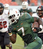
And it’s crooked, af. I’m just not sure what material they r using since it’s their “optimum” material. As soon as those pads come on, The ACC patch it tilted one way, The Adidas logo is tilted another way, & the 22 is distorted.

By comparison, notice Gus’ jersey in 2014, that despite being engaged, in motion, the jersey remains aesthetically intact, both in fit & design.
 

Attachments

  • 039F6F45-2526-40FF-A43E-5AAECC20F292.jpeg
    039F6F45-2526-40FF-A43E-5AAECC20F292.jpeg
    1.2 MB · Views: 40
Advertisement
Adidas just need to get their **** right. its always looked bad they just cant get their sowing and placements right
 
Advertisement
well this sucks... we can have so much better UNI's ... even the polo is awful its just orange and white, no green
 
The burnt orange inside the shield gets me every time I see the orange jersey 🤣

You can’t even see our iconic logo on the jersey. I guess it’s a step above not having our logo on the jersey at all but man I don’t get how this passes QC View attachment 202680
I guess that shield nonsense is the price for not having the U all stretched the f*ck out.

I don't care about uniforms like you guys do, but you'd think Adidas could, by this point, fix the problems without creating new ones. Actually, the funniest part of this is that if we get as good as we all assume we're about to, people will look back fondly at that shield. You know people are missing that ridiculous ibis thing from the early 2000s.
 
Advertisement
Advertisement
Back
Top