forums
You are using an out of date browser. It may not display this or other websites correctly.
You should upgrade or use an alternative browser.
You should upgrade or use an alternative browser.
The New Unis (allegedly)
- Thread starter IndayArtHauz
- Start date
Advertisement
- Joined
- Jan 29, 2013
- Messages
- 17,171
tomorrow night at 5Where are the pics, didn't they get unveiled like 2 hours ago?
Sebastian_29
15-0
- Joined
- Jun 2, 2016
- Messages
- 798
Green pants suck. Get rid of them completely. But the storm trooper needs to remain
MiamiCategory5
Freshman
- Joined
- Nov 5, 2011
- Messages
- 455
When can we buy the new unis and when will they be available? All Canes, Football Fanatics, etc.?
- Joined
- Sep 4, 2012
- Messages
- 43,263
Where's the neon yellow and pimp hat feathers? We need to wear grotesque clown like Oregon **** so the kids will think we be fresh. Oregon always has the number one recruiting class.
ThomasM
Retired from college football
- Joined
- Jul 9, 2014
- Messages
- 17,865
No more green jerseys.
Actually, I thought we were wearing green against GT.
Pearson704
Bunker Mentality
- Joined
- Jan 16, 2016
- Messages
- 8,998
It's great for the Miami fan who refuses to move on from 1988, but it's a look that appeared dated in 1995, and looks just as dated now. Miami's identity as a program has always been a little forward and unique. It's similar to the fanbase clamoring for Butch, this program has far too many people with both feet firmly in the past. Miami wearing a plain uniform, a uniform that most recruits wouldn't associate with Miami(Because a lot of them weren't even born the last time we wore this template) isn't a good look. Don't get me wrong, I have plenty of issues with the current template(Eliminate the stupid speed lines on the sleeves, adjust the pants a bit, especially the oversized U), but recruits like the template, and those are the people whose opinion matters.
We should always honor the past, while striding confidently into the future. These uniforms aren't a confident stride into the future, it's a permanent throwback. I guess green alternates are out the window, that's just awful.
Alabama has been playing with the same style uniform since the stone age
Uniforms do not win football ball games
Real ones will look slightly different. The last Nike uniforms were awesome. The ones we have now are atrocious. This will be a good reset and base uniform. Some things shouldn't be left to the past.
Advertisement
Pearson704
Bunker Mentality
- Joined
- Jan 16, 2016
- Messages
- 8,998
I would like to see pants below the knees all the way to the ankle. Orange socks would look nice with black wellington boot-like shoes. Shirts should be worn out to cover for the extra long pants and long enough to be tieable so they can be tightened up into a bun but also made tear able for the running backs. Helmets should be done away with so players can be seen on TV. The U can be cut into their haircut.
Yeah, that's the ticket! ;-)
:q3XKXeX:
Pearson704
Bunker Mentality
- Joined
- Jan 16, 2016
- Messages
- 8,998
It's great for the Miami fan who refuses to move on from 1988, but it's a look that appeared dated in 1995, and looks just as dated now. Miami's identity as a program has always been a little forward and unique. It's similar to the fanbase clamoring for Butch, this program has far too many people with both feet firmly in the past. Miami wearing a plain uniform, a uniform that most recruits wouldn't associate with Miami(Because a lot of them weren't even born the last time we wore this template) isn't a good look. Don't get me wrong, I have plenty of issues with the current template(Eliminate the stupid speed lines on the sleeves, adjust the pants a bit, especially the oversized U), but recruits like the template, and those are the people whose opinion matters.
We should always honor the past, while striding confidently into the future. These uniforms aren't a confident stride into the future, it's a permanent throwback. I guess green alternates are out the window, that's just awful.
It's our brand. The []_[] transcends football, because it's socially relevant in a way no other team is. We need to have this look in heavy rotation for brand recognition. Oregon and Maryland have no brand and that's why they can do the uniform dance. Years ago in early 2000s D. Shalala hired a branding firm to change the logo for the entire University. The firm did research and came back to say 'you have an iconic logo/brand already...Everyone knows the []_[].' So Donna in all her wisdom changed the overall University logo to the []_[]. As I recall, at the time we were the first University to make the athletic logo the University's identity. Check the history.
History reveals iconic ?U? logo?s meaning
Last edited:
- Joined
- Jan 2, 2016
- Messages
- 2,398
No more green jerseys.
Actually, I thought we were wearing green against GT.
We are. It's been stated many times in the other 57 jersey threads.Green for GT and orange for the other home games.
KevinCaneFace
Senior
- Joined
- Jul 18, 2014
- Messages
- 6,534
It's dumb that we have so many fans against green jerseys and pants. No, we didn't wear them in the 80's. But the best team of all time wore them and it is the other half of our colors.
JimmyJohnsonsHair
All-ACC
- Joined
- Dec 2, 2011
- Messages
- 7,016
These are awesome. Exactly what I was hoping for. Crown Adidas.
- Joined
- Apr 7, 2016
- Messages
- 3,977
These are awesome. Exactly what I was hoping for. Crown Adidas.
I'm not crowning **** until I actually see the **** uniforms
Advertisement
itsacanething
Senior
- Joined
- Jan 31, 2012
- Messages
- 5,687
It's great for the Miami fan who refuses to move on from 1988, but it's a look that appeared dated in 1995, and looks just as dated now. Miami's identity as a program has always been a little forward and unique. It's similar to the fanbase clamoring for Butch, this program has far too many people with both feet firmly in the past. Miami wearing a plain uniform, a uniform that most recruits wouldn't associate with Miami(Because a lot of them weren't even born the last time we wore this template) isn't a good look. Don't get me wrong, I have plenty of issues with the current template(Eliminate the stupid speed lines on the sleeves, adjust the pants a bit, especially the oversized U), but recruits like the template, and those are the people whose opinion matters.
We should always honor the past, while striding confidently into the future. These uniforms aren't a confident stride into the future, it's a permanent throwback. I guess green alternates are out the window, that's just awful.
It's our brand. The []_[] transcends football, because it's socially relevant in a way no other team is. We need to have this look in heavy rotation for brand recognition. Oregon and Maryland have no brand and that's why they can do the uniform dance. Years ago in early 2000s D. Shalala hired a branding firm to change the logo for the entire University. The firm did research and came back to say 'you have an iconic logo/brand already...Everyone knows the []_[].' So Donna in all her wisdom changed the overall University logo to the []_[]. As I recall, at the time we were the first University to make the athletic logo the University's identity. Check the history.
History reveals iconic ?U? logo?s meaning
I never heard any references to "the u" until I heard kellen Winslow give his solider speech. i would be interested in others opinions but i credit winslow with coming up with the U as a name for the football team.
Last edited:
section9
Junior
- Joined
- Dec 16, 2014
- Messages
- 5,404
It's great for the Miami fan who refuses to move on from 1988, but it's a look that appeared dated in 1995, and looks just as dated now. Miami's identity as a program has always been a little forward and unique. It's similar to the fanbase clamoring for Butch, this program has far too many people with both feet firmly in the past. Miami wearing a plain uniform, a uniform that most recruits wouldn't associate with Miami(Because a lot of them weren't even born the last time we wore this template) isn't a good look. Don't get me wrong, I have plenty of issues with the current template(Eliminate the stupid speed lines on the sleeves, adjust the pants a bit, especially the oversized U), but recruits like the template, and those are the people whose opinion matters.
We should always honor the past, while striding confidently into the future. These uniforms aren't a confident stride into the future, it's a permanent throwback. I guess green alternates are out the window, that's just awful.
It's our brand. The []_[] transcends football, because it's socially relevant in a way no other team is. We need to have this look in heavy rotation for brand recognition. Oregon and Maryland have no brand and that's why they can do the uniform dance. Years ago in early 2000s D. Shalala hired a branding firm to change the logo for the entire University. The firm did research and came back to say 'you have an iconic logo/brand already...Everyone knows the []_[].' So Donna in all her wisdom changed the overall University logo to the []_[]. As I recall, at the time we were the first University to make the athletic logo the University's identity. Check the history.
History reveals iconic ?U? logo?s meaning
I never heard any references to "the u" until I heard kellen Winslow give his solider speech. i would be interested in others opinions but i credit winslow with coming up with the U as a name for the football team.
Perhaps Schnelly's decision to keep the "U" on the side of the helmet? That goes back to the late Seventies, though.
- Joined
- Oct 7, 2012
- Messages
- 18,212
It's dumb that we have so many fans against green jerseys and pants. No, we didn't wear them in the 80's. But the best team of all time wore them and it is the other half of our colors.
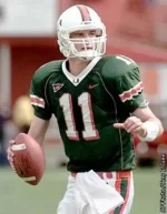
It's dumb because you think it's dumb? I'm against them because I think they're ugly. Not because the 1980s teams didn't wear them. If we have them, and they're the same design as the others, fine. I was ok with these....

I didn't like these

Attachments
- Joined
- Nov 5, 2011
- Messages
- 18,785
I like these Green jerseys too. The ones after those completely sucked. I'm good with wearing Green/White once a year against a mediocre opponent. We did this up till 2004.It's dumb that we have so many fans against green jerseys and pants. No, we didn't wear them in the 80's. But the best team of all time wore them and it is the other half of our colors.
It's dumb because you think it's dumb? I'm against them because I think they're ugly. Not because the 1980s teams didn't wear them. If we have them, and they're the same design as the others, fine. I was ok with these....
View attachment 38711
I didn't like these
View attachment 38712