- Joined
- Nov 5, 2011
- Messages
- 18,795
My sentiments exactly.The old block numbers were too gawdy imo. Re-introducing the Y2K jersey number font gives us a sleeker and more contemporary look while maintaining that classic feel. Everyone wins.
My sentiments exactly.The old block numbers were too gawdy imo. Re-introducing the Y2K jersey number font gives us a sleeker and more contemporary look while maintaining that classic feel. Everyone wins.
Next issue to tackle is eliminating alternate unis. They all stink.
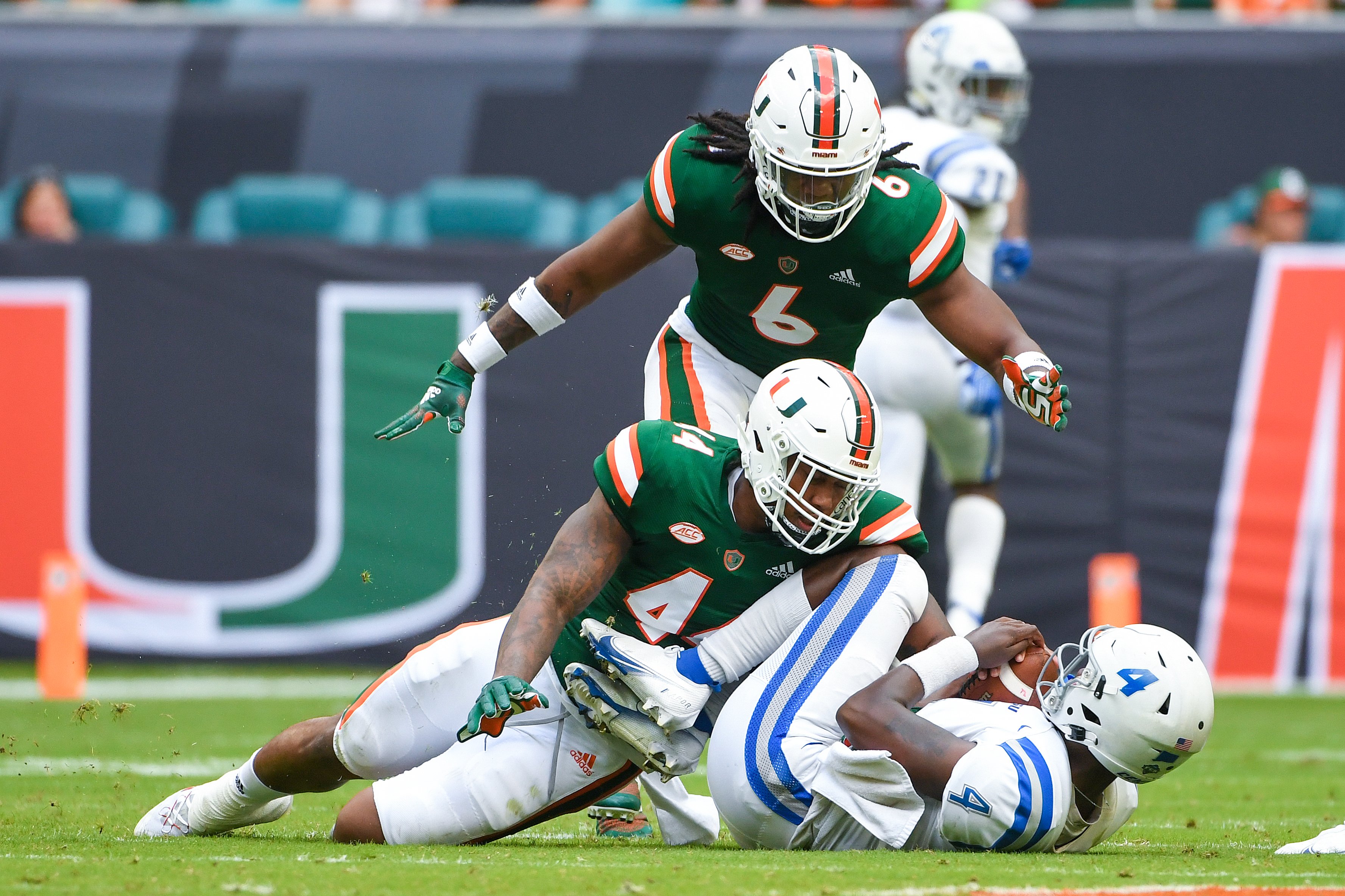
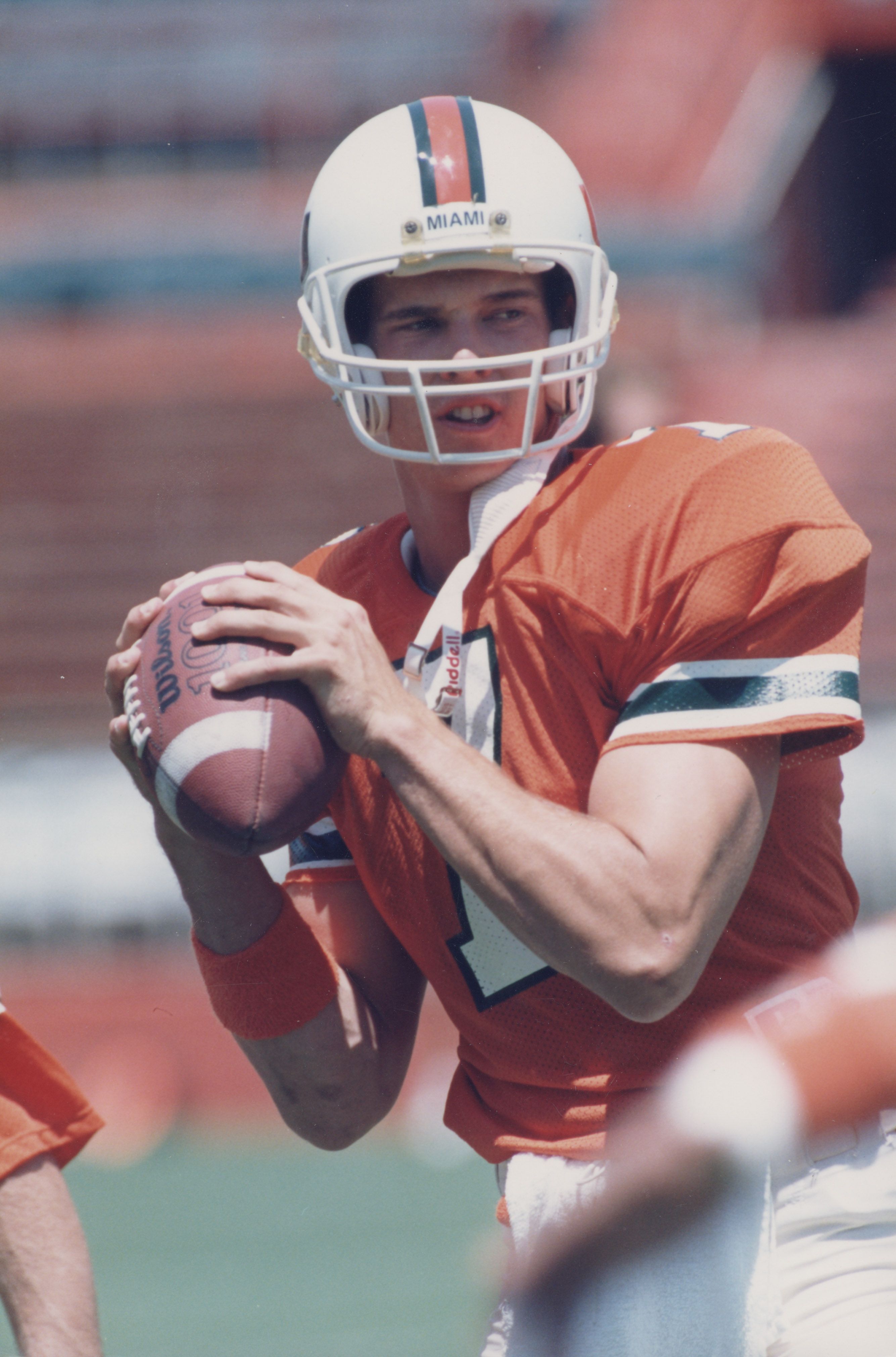
Also need to adjust the shade of green being used and go back to the more traditional darker green.
Now, I don’t know this for sure, but I recall Michigan fans complaining about the yellow that was used by Adidas compared to their Maize that is actually the school’s yellow. Come to find out, there was nothing Adidas could do. When Michigan became an OG Nike school, Nike literally had a patent on all designs, including Maize. It could be the shades r matched as close as possible, but Nike may have a patent on the true colors of ours.
Again, I’m speculating simply b/c that’s what Michigan went through w/ Adidas. Matter of fact, when they went w/ Jordan brand, their campaign was something like bringing back the Maize and Blue.
adidas Maize vs. Nike Maize | mgoblog
I originally posted this on the mainpage in the comments and I saw a few different opinions on this when I thought most want the old Maize back so I figure I'd make a discussion out of it on the board. Yesterday, I went on Wayback Machine to the MDen site from 2007 and found the Nike version of...mgoblog.com
UM Colors: "Sun" and Blue | mgoblog
Interesting note in a recent Daily article by volleyball players Lexi Zimmerman (swoons) and Courtney Fletcher. Apparently, Nike trademarked the "maize" color, so Adidas had to make up their own color called "sun": Nike also copyrighted the color “Maize,” so Adidas actually had to make a new...
Next issue to tackle is eliminating alternate unis. They all stink.
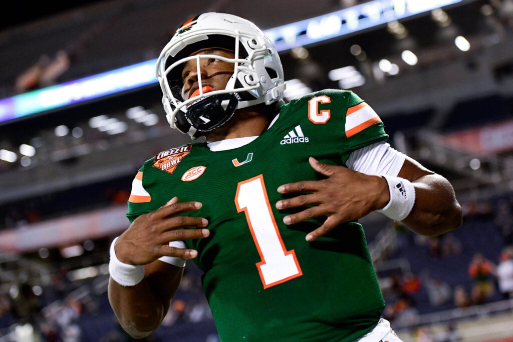
Sometimes the simplest answers are the best answers.Orange over white at home
Green over white at home once a year
White over orange on the road
Stormtroopers for big road games
Done.
Those have been our design. I’m good with the stripes.The stripe pattern needs to be synced for each uniform combo, it should match the helmet.
Helmet: green - orange - green
Jersey: white - green -white
Pants: orange - green - orange
This is ridiculous. It should be ‘green - orange - green’ on the helmet, jersey & pants.
I wish I could alter the graphics to show how much stronger this would look.
View attachment 152652
It's an interesting take about the stripes. One I had not considered. But it's been this way for a minute.Those have been our design. I’m good with the stripes.
Always been my favorite. All my Canes gear is green. Besides, the green matches my complexion better.Green over white with white cleats is our best look at the moment