Nothing to feel guilty about, bro. If we all thought the same, life would be boring. Lol. I know several Canes fans (& when I say several, I mean 5 including U…lol) out of the 951,000 Canes fan who don’t like this jersey. LMAO. Nah, but seriously, I get it. I particularly like classics, & throw back classics. If we do futuristic, as long as it’s not too wild, I’m good. Hence, why I hated the mix match Nike Pro Combat joints. I got the tech in them, I appreciated that, BUT I HATED THE DESIGN. Horrible, horrible, horrible, & I rank those designs up there w/ the Adidas 2015 joints.
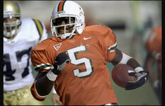
I know for sure I’m in the minority, but I actually liked the infamous bra strap joints. I think if we won in them, ppl would have a different opinion, but they also signify the beginning of our golden age. They were simple, & clean w/ really good details.
I’m just not in to all of the glow in the dark, chit. Didn’t like Nike coming up w/ this concept w/ MSU & UO, & I don’t like Adidas copying this w/ us. Give that to high school kids or a G5 program to feel special, but not us. Don’t mind black unis at all, but man this final execution leaves something to the imagination. They could’ve done reflective white numbers outlined in the neon Orange & Green & I would’ve “OK” w/ it. But Ghost Buster Slime Green!? F!
Lol
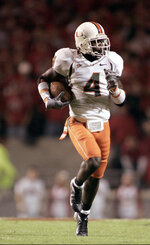
 on the color on color. I don’t like it on one player in a photo shoot and certainly don’t like 11 guys running around on the field with that look. It actually affects my game watching. White on white can look tight though with the right color scheme in the detail.