- Joined
- Apr 15, 2017
- Messages
- 1,763
You and your cot**** examples...
You and your cot**** examples...
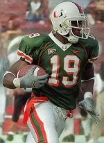
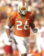
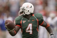
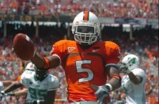
This **** has a whole science to it and for some reason I love it lol. I remember the 99 season with James Scott, when Miami debuted the green jerseys with the orange lines which would later prove to be the predecessors of the 2000-03 batwing template that Sean Taylor wore so well. 2004 was the Antrel Rolle takeover FSU game and I remember noticing how much tighter the jersey fit was compared to previous years, yet the players were moving very well in them. I fondly remember these as the “Devin Hester era” jerseys, probably because his electric style play made them look good lol . The 2007 (bra strap unis) is where Nike began to go downhill for me design wise but the quality was always there. It’s pretty neat to hear how the youth of today observe the deference between brands from their up close and personal perspectives. Appreciate you sharing that insight fam.To be clear, Adidas has come an absolutely long way in just the past 3 yrs, alone, in their jersey designs & the chasis that they use; but, they r still light yrs behind Nike. Part of Adidas’ rebrand strategy have been led by former Nike designers, but the biggest difference is going to be the proprietary materials Nike utilizes.
In fact, the template that Adidas is using today is something Nike used way back in 2004-5 to put that in perspective. Talked to a youngster that just transferred from an Adidas school to a Jordan brand school this past 4th of July, & I simply asked how does it feel to be a Jumpman athlete?
He told me it’s a different experience in gear and jersey fit. He said when he got to campus, they laser scanned his foot, put him in cleats based upon the scan & his position, & the jersey fitted like a glove, while breathable & water resistant. He said Adidas jerseys were cool, too, but they felt like it had too much material while still being thin, & it was felt like a step above HS.
To be fair, his former school did just get the newest template which is what we have, so his opinion could’ve been a bit biased b/c of the older materials.
This is how the name plate font should look. Also, notice that is also the correct shade of green. Adidas has made it some lighter shade which looks like ****Bingo.
This is how the name plate font should look. Also, notice that is also the correct shade of green. Adidas has made it some lighter shade which looks like ****
(they also ****ed up our orange but that's for another post)
View attachment 330864
Meat me in the blue lotMan these threads never fail to deliver the ***
All jokes aside I’d ******* love thatMeat me in the blue lot
Like… pine green or sum **** lolLike seriously what in the **** shade of green is this? Also love the light orange accents (compare it to the helmet)
Adidas really does stand for "All Day I Dream About ****"
View attachment 330868
floor is yours my man, what do you want to talk aboutMan these threads never fail to deliver the ***
Shut the **** upfloor is yours my man, what do you want to talk about
lmaooo exactlyShut the **** up
Season ain't started yet. Y'all should meet at Titanic!Meat me in the blue lot
New numbers = new uniforms but we can agree to disagree3 things:
1. Design, material etc etc is the same. Not sure why u continue to think we have new uniforms.
2. Why is this jawn so crooked, including the commemorative patch up top
3. Why is this jawn dirty for a photo opp??
It's all the same except slightly different numbaz