Uniform Changes

Thank you!!!

I knew Richt wouldn't put up w/ the crap Adidas was giving us. Michigan fans couldn't wait to leave Adidas...but Adidas needs us, and I think they've done a good job in listening to us. When the font came out, we complained about it, and they fixed it, to a certain extent. Now, we've complained about the jerseys and they are trying to fix it. I do like that about them.

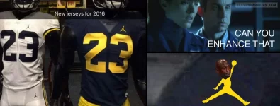
And michigan went and put a basketball player logo on their jerseys. Stupidest **** i've ever seen.

Jordan is no longer "just" a basketball brand (see Dez Bryant, Charles Woodson, Alshon Jeffery, our very own Andre Johnson, and CC Sabathia, Neymar Jr, Andre Ward, etc.) Jordan is becoming the "brand of excellence" from Nike, based upon Jordan's rep. Those days of just b-ball are over.

But how long until Michigan gets a CRYING JORDAN on their jersey?
 
Advertisement
Thank you!!!

I knew Richt wouldn't put up w/ the crap Adidas was giving us. Michigan fans couldn't wait to leave Adidas...but Adidas needs us, and I think they've done a good job in listening to us. When the font came out, we complained about it, and they fixed it, to a certain extent. Now, we've complained about the jerseys and they are trying to fix it. I do like that about them.

And michigan went and put a basketball player logo on their jerseys. Stupidest **** i've ever seen.

Jordan is no longer "just" a basketball brand (see Dez Bryant, Charles Woodson, Alshon Jeffery, our very own Andre Johnson, and CC Sabathia, Neymar Jr, Andre Ward, etc.) Jordan is becoming the "brand of excellence" from Nike, based upon Jordan's rep. Those days of just b-ball are over.

But how long until Michigan gets a CRYING JORDAN on their jersey?

Oh man. That's going to be epic.
 
Not a fan of old jerseys but its gotta be better tha what we have and maybe ill change my tune when i see them
 
Thank you!!!

I knew Richt wouldn't put up w/ the crap Adidas was giving us. Michigan fans couldn't wait to leave Adidas...but Adidas needs us, and I think they've done a good job in listening to us. When the font came out, we complained about it, and they fixed it, to a certain extent. Now, we've complained about the jerseys and they are trying to fix it. I do like that about them.

And michigan went and put a basketball player logo on their jerseys. Stupidest **** i've ever seen.

Jordan is no longer "just" a basketball brand (see Dez Bryant, Charles Woodson, Alshon Jeffery, our very own Andre Johnson, and CC Sabathia, Neymar Jr, Andre Ward, etc.) Jordan is becoming the "brand of excellence" from Nike, based upon Jordan's rep. Those days of just b-ball are over.

But how long until Michigan gets a CRYING JORDAN on their jersey?
Already happened.

jumpman-um.jpg.pagespeed.ce.JAFNVrGkPp.webp
 
Wtf are you saying? You really think last year's jerseys are the best we've had since the early 2000's? LMAO. The 2014 Nike redesign, minus the alternate helmets, were ****ing light years better than the **** adidas put out for us last year. Unbelievable.

Yeah minus the helmets they were average, you're right. But if you're going to tell me anything Adidas has given us is anywhere near as bad as those ******* helmets Nike gave us, you're crazy.

See my opinion is, I don't particulary think having shiny numbers looks too good, but it really isn't a big deal. I think having Miami on the front is at worst average, and at best good. I think the feathers on the shoulder look average. As a whole the uniforms look good, and the alternates look legit. However, Nike ******* up our helmets is probably the biggest mistake possible.

You're too busy getting upset over small things, meanwhile Nike made us look like ******* absolute idiots when we wore those orange/green helmets. And the Tramp Stamp and Eyebrow they gave us in the previous uni's were trash.
 
Thank you!!!

I knew Richt wouldn't put up w/ the crap Adidas was giving us. Michigan fans couldn't wait to leave Adidas...but Adidas needs us, and I think they've done a good job in listening to us. When the font came out, we complained about it, and they fixed it, to a certain extent. Now, we've complained about the jerseys and they are trying to fix it. I do like that about them.

And michigan went and put a basketball player logo on their jerseys. Stupidest **** i've ever seen.

Jordan is no longer "just" a basketball brand (see Dez Bryant, Charles Woodson, Alshon Jeffery, our very own Andre Johnson, and CC Sabathia, Neymar Jr, Andre Ward, etc.) Jordan is becoming the "brand of excellence" from Nike, based upon Jordan's rep. Those days of just b-ball are over.

"Brand of Excellence" lmfao. Nike found a found a way to make poor people to feel fresh by spending 25% of their monthly paycheck on a pair of shoes that cost 3 dollars to make. I remember when i was 12 and thought a new pair of shoes would make me jump higher too. Seriously though, go to any bus stop or dollar general and tell me how many 16-24 year old males you see that are wearing jordans and probably don't have 500$ in their bank account. Nike is literally pimping the **** out of that demographic and have been for 35 years.

And Kanye is not??? Remember his whole slant that he's making shoes for the people? Yet, ninjas are getting their throats slashed for a pair of $750 boots. Paying $2k for a torn up sweater. Face it, bruh....folks ain't flocking to by pro-wings or some Starbury's. Hakeem Olajuwon shoes wasn't selling out at K-Mart, playa. Chicks like Red Bottoms and dudes like J's and Yeezy's b/c of the price tag. K dot had a song about being slaves of the fashion industry.
 
Advertisement
Wtf are you saying? You really think last year's jerseys are the best we've had since the early 2000's? LMAO. The 2014 Nike redesign, minus the alternate helmets, were ****ing light years better than the **** adidas put out for us last year. Unbelievable.

Yeah minus the helmets they were average, you're right. But if you're going to tell me anything Adidas has given us is anywhere near as bad as those ****ing helmets Nike gave us, you're crazy.

See my opinion is, I don't particulary think having shiny numbers looks too good, but it really isn't a big deal. I think having Miami on the front is at worst average, and at best good. I think the feathers on the shoulder look average. As a whole the uniforms look good, and the alternates look legit. However, Nike ****ing up our helmets is probably the biggest mistake possible.

You're too busy getting upset over small things, meanwhile Nike made us look like ****ing absolute idiots when we wore those orange/green helmets. And the Tramp Stamp and Eyebrow they gave us in the previous uni's were trash.

You do realize that both the green and bronze helmets came from an updated version of the 1948 and 1976 version of our helmets, right? Adidas uniforms have been complete and utter trash...that's including the fan jerseys. Our jersey's look like a blind kid was given some crayons and told to use his imagination in drawing out our jerseys.

I don't care what they were inspired by they looked like trash. Stop acting like we have some crazy tradition with our uniforms like we're Bama or PSU. Basically for us just don't **** up our helmet, and that is exactly what Nike did. Adidas has done great for us so far, stop *****ing.
 
Wtf are you saying? You really think last year's jerseys are the best we've had since the early 2000's? LMAO. The 2014 Nike redesign, minus the alternate helmets, were ****ing light years better than the **** adidas put out for us last year. Unbelievable.

Yeah minus the helmets they were average, you're right. But if you're going to tell me anything Adidas has given us is anywhere near as bad as those ****ing helmets Nike gave us, you're crazy.

See my opinion is, I don't particulary think having shiny numbers looks too good, but it really isn't a big deal. I think having Miami on the front is at worst average, and at best good. I think the feathers on the shoulder look average. As a whole the uniforms look good, and the alternates look legit. However, Nike ****ing up our helmets is probably the biggest mistake possible.

You're too busy getting upset over small things, meanwhile Nike made us look like ****ing absolute idiots when we wore those orange/green helmets. And the Tramp Stamp and Eyebrow they gave us in the previous uni's were trash.

You do realize that both the green and bronze helmets came from an updated version of the 1948 and 1976 version of our helmets, right? Adidas uniforms have been complete and utter trash...that's including the fan jerseys. Our jersey's look like a blind kid was given some crayons and told to use his imagination in drawing out our jerseys.

Lol exactly. Plus, buddy is forgetting that adidas gave us alternate helmets last year as well. Shiny, pressed on numbers that look like they can be easily torn off. ******* feathers. Terrible pant design. Fan apparel that is absolutely horrendous looking. Spring football practice jerseys that were LITERALLY being torn apart, with numbers fading and getting torn off. Everything they've put out for us, except for the fall practice jerseys which are nice and the baseball uni's, has been an utter abomination. And this guy is saying that just because Nike gave us some alternate helmets, it makes anything adidas makes automatically better looking. Lmaoooooooooooo. I think the 2014 Nike redesign was tight actually, was of wayyyyyyyyyyyyy superior quality, and actually made us look like a friggin NFL squad.

Like I said in an earlier post, I would love to compare apparel sales now versus the Nike years. I've bought two Miami adidas shirts that have a horrendous fit, and are of terrible quality. I'll never wear them again safe to say. Most people I speak to tell me they have avoided buying adidas Miami gear. I've bought whatever remaining Miami Nike gear they still have to be honest.
 
Wtf are you saying? You really think last year's jerseys are the best we've had since the early 2000's? LMAO. The 2014 Nike redesign, minus the alternate helmets, were ****ing light years better than the **** adidas put out for us last year. Unbelievable.

Yeah minus the helmets they were average, you're right. But if you're going to tell me anything Adidas has given us is anywhere near as bad as those ****ing helmets Nike gave us, you're crazy.

See my opinion is, I don't particulary think having shiny numbers looks too good, but it really isn't a big deal. I think having Miami on the front is at worst average, and at best good. I think the feathers on the shoulder look average. As a whole the uniforms look good, and the alternates look legit. However, Nike ****ing up our helmets is probably the biggest mistake possible.

You're too busy getting upset over small things, meanwhile Nike made us look like ****ing absolute idiots when we wore those orange/green helmets. And the Tramp Stamp and Eyebrow they gave us in the previous uni's were trash.

You do realize that both the green and bronze helmets came from an updated version of the 1948 and 1976 version of our helmets, right? Adidas uniforms have been complete and utter trash...that's including the fan jerseys. Our jersey's look like a blind kid was given some crayons and told to use his imagination in drawing out our jerseys.

I don't care what they were inspired by they looked like trash. Stop acting like we have some crazy tradition with our uniforms like we're Bama or PSU. Basically for us just don't **** up our helmet, and that is exactly what Nike did. Adidas has done great for us so far, stop *****ing.

Huh?? I don't know if you're a rep for Adidas or what, but majority of the world would disagree w/ your assessment. The fact is Nike never "f'd" w/ the lids...they kept all of our lids (except the smoke) w/in our history. Maybe you should be more astute to your Hurricane history before you spat off what Nike did and didn't do.

You had some new fans saying "OMG, why did they put warning flags on our helmets?" Uhhh, how about that was our helmet back in 1968. "Omg, I can't believe we have these green orament helmets." How about you look at our helmets from 1974. "But we have these bronze helmets, what was Nike thinking?" They were thinking of the color of our helmets in 1937.

We've had so many different designs over the last several years and Nike did a wonderful job, for the most part, in giving some our older looks w/ a modern design. Even our 2002 jerseys mimicked the 1970 jerseys. They fell off on a couple of designs...like I did not like their pro-combat designs for us, nor did I like their pro-combat helmet they gave us, but I would still take that 10 out of 10 than what Adidas have given us, thus far.

What Adidas has done is give us poor uniform designs, and they are better than that. We have plastic on our uniforms...PLASTIC! Plus, not one uniform, NOT ONE has "Hurricanes, or Miami, or Canes" on the front. You can go through every last one of our jerseys and you will not see that.
 
Wtf are you saying? You really think last year's jerseys are the best we've had since the early 2000's? LMAO. The 2014 Nike redesign, minus the alternate helmets, were ****ing light years better than the **** adidas put out for us last year. Unbelievable.

Yeah minus the helmets they were average, you're right. But if you're going to tell me anything Adidas has given us is anywhere near as bad as those ****ing helmets Nike gave us, you're crazy.

See my opinion is, I don't particulary think having shiny numbers looks too good, but it really isn't a big deal. I think having Miami on the front is at worst average, and at best good. I think the feathers on the shoulder look average. As a whole the uniforms look good, and the alternates look legit. However, Nike ****ing up our helmets is probably the biggest mistake possible.

You're too busy getting upset over small things, meanwhile Nike made us look like ****ing absolute idiots when we wore those orange/green helmets. And the Tramp Stamp and Eyebrow they gave us in the previous uni's were trash.

You do realize that both the green and bronze helmets came from an updated version of the 1948 and 1976 version of our helmets, right? Adidas uniforms have been complete and utter trash...that's including the fan jerseys. Our jersey's look like a blind kid was given some crayons and told to use his imagination in drawing out our jerseys.

Lol exactly. Plus, buddy is forgetting that adidas gave us alternate helmets last year as well. Shiny, pressed on numbers that look like they can be easily torn off. ****ing feathers. Terrible pant design. Fan apparel that is absolutely horrendous looking. Spring football practice jerseys that were LITERALLY being torn apart, with numbers fading and getting torn off. Everything they've put out for us, except for the fall practice jerseys which are nice and the baseball uni's, has been an utter abomination. And this guy is saying that just because Nike gave us some alternate helmets, it makes anything adidas makes automatically better looking. Lmaoooooooooooo. I think the 2014 Nike redesign was tight actually, was of wayyyyyyyyyyyyy superior quality, and actually made us look like a friggin NFL squad.

Like I said in an earlier post, I would love to compare apparel sales now versus the Nike years. I've bought two Miami adidas shirts that have a horrendous fit, and are of terrible quality. I'll never wear them again safe to say. Most people I speak to tell me they have avoided buying adidas Miami gear. I've bought whatever remaining Miami Nike gear they still have to be honest.
[MENTION=6519]HurricaneOmeezy[/MENTION]: EXACTLY!!! ****, even our "traditional" weekly game day helmet were alternates. lol. They weren't even orange and green...they were like metallic orange and green!

I know when the NFL signed exclusive rights w/ Adidas after leaving Nike, their sales plummeted. When they re-upped w/ Nike, the sales increased by 500% on the first day.

I know when Michigan went over to Adidas, their sales went down 300% and now that they've re-upped w/ Nike, their sales are projected to be at an all time high.

They just had a top 10 best design uniform forum on Bleacher Report and not one Adidas school was on there. Even ND was getting fed up w/ Adidas and their designs. Adidas don't want to be in the apparel business...they want to be in the athlete endorsement business. They bled money w/ the NBA and NFL b/c people weren't buying their ish, and athletes were still signing w/ Nike, UA, and even Anta over Adidas.
 
Last edited:
nike made awful alternate helmets those christmas ornament lids were unforgivable. both nike and adidas add unnecessary junk to all these uniforms to try and stand out and make them ugly just keep it simple. remember when nike got the contract in the NFL they put those awful disco half collars on all the jerseys and fans and teams complained until they had them removed

Several NFL Teams Ditching Terrible Nike Collar Design | Chris Creamer's SportsLogos.Net News and Blog : New Logos and New Uniforms news, photos, and rumours
 
Advertisement
Wtf are you saying? You really think last year's jerseys are the best we've had since the early 2000's? LMAO. The 2014 Nike redesign, minus the alternate helmets, were ****ing light years better than the **** adidas put out for us last year. Unbelievable.

Yeah minus the helmets they were average, you're right. But if you're going to tell me anything Adidas has given us is anywhere near as bad as those ****ing helmets Nike gave us, you're crazy.

See my opinion is, I don't particulary think having shiny numbers looks too good, but it really isn't a big deal. I think having Miami on the front is at worst average, and at best good. I think the feathers on the shoulder look average. As a whole the uniforms look good, and the alternates look legit. However, Nike ****ing up our helmets is probably the biggest mistake possible.

You're too busy getting upset over small things, meanwhile Nike made us look like ****ing absolute idiots when we wore those orange/green helmets. And the Tramp Stamp and Eyebrow they gave us in the previous uni's were trash.

You do realize that both the green and bronze helmets came from an updated version of the 1948 and 1976 version of our helmets, right? Adidas uniforms have been complete and utter trash...that's including the fan jerseys. Our jersey's look like a blind kid was given some crayons and told to use his imagination in drawing out our jerseys.

I don't care what they were inspired by they looked like trash. Stop acting like we have some crazy tradition with our uniforms like we're Bama or PSU. Basically for us just don't **** up our helmet, and that is exactly what Nike did. Adidas has done great for us so far, stop *****ing.

Huh?? I don't know if you're a rep for Adidas or what, but majority of the world would disagree w/ your assessment. The fact is Nike never "f'd" w/ the lids...they kept all of our lids (except the smoke) w/in our history. Maybe you should be more astute to your Hurricane history before you spat off what Nike did and didn't do.

You had some new fans saying "OMG, why did they put warning flags on our helmets?" Uhhh, how about that was our helmet back in 1968. "Omg, I can't believe we have these green orament helmets." How about you look at our helmets from 1974. "But we have these bronze helmets, what was Nike thinking?" They were thinking of the color of our helmets in 1937.

We've had so many different designs over the last several years and Nike did a wonderful job, for the most part, in giving some our older looks w/ a modern design. Even our 2002 jerseys mimicked the 1970 jerseys. They fell off on a couple of designs...like I did not like their pro-combat designs for us, nor did I like their pro-combat helmet they gave us, but I would still take that 10 out of 10 than what Adidas have given us, thus far.

What Adidas has done is give us poor uniform designs, and they are better than that. We have plastic on our uniforms...PLASTIC! Plus, not one uniform, NOT ONE has "Hurricanes, or Miami, or Canes" on the front. You can go through every last one of our jerseys and you will not see that.

Once again you're saying these uniforms are bad almost solely because they aren't what we used to wear, and then you're giving Nike a pass for those ****** as **** Ornament helmets because we wore green in the 50's or whatever. When did we wear shiny orange helmets? And I'm not even talking about the helmets with the hurricane flag on them. I'm talking specifically what they did in 2014, and any answer other than an agreement that they were absolutely terrible is wrong.

We aren't Bama or PSU or Michigan. Just because we have never had Miami across the front doesn't mean we can't or shouldn't have it. Again our uniform tradition is not about less is more or keeping everything the same.
and im not saying you cant not like them or wish they were better or whatever. im just tired of the people that make such a huge deal of small little problems and basically acting like its trash (probably only because its adidas and not nike).
 
Last edited:
We break out the new UNIs against the Seminoles and after our first TD, Richt sends all the coaches and players from the sideline out to celebrate in the End zone and gladly takes the penalty....talk about blowing up the fans at the stadium.
 
Wtf are you saying? You really think last year's jerseys are the best we've had since the early 2000's? LMAO. The 2014 Nike redesign, minus the alternate helmets, were ****ing light years better than the **** adidas put out for us last year. Unbelievable.

Yeah minus the helmets they were average, you're right. But if you're going to tell me anything Adidas has given us is anywhere near as bad as those ****ing helmets Nike gave us, you're crazy.

See my opinion is, I don't particulary think having shiny numbers looks too good, but it really isn't a big deal. I think having Miami on the front is at worst average, and at best good. I think the feathers on the shoulder look average. As a whole the uniforms look good, and the alternates look legit. However, Nike ****ing up our helmets is probably the biggest mistake possible.

You're too busy getting upset over small things, meanwhile Nike made us look like ****ing absolute idiots when we wore those orange/green helmets. And the Tramp Stamp and Eyebrow they gave us in the previous uni's were trash.

You do realize that both the green and bronze helmets came from an updated version of the 1948 and 1976 version of our helmets, right? Adidas uniforms have been complete and utter trash...that's including the fan jerseys. Our jersey's look like a blind kid was given some crayons and told to use his imagination in drawing out our jerseys.

Lol exactly. Plus, buddy is forgetting that adidas gave us alternate helmets last year as well. Shiny, pressed on numbers that look like they can be easily torn off. ****ing feathers. Terrible pant design. Fan apparel that is absolutely horrendous looking. Spring football practice jerseys that were LITERALLY being torn apart, with numbers fading and getting torn off. Everything they've put out for us, except for the fall practice jerseys which are nice and the baseball uni's, has been an utter abomination. And this guy is saying that just because Nike gave us some alternate helmets, it makes anything adidas makes automatically better looking. Lmaoooooooooooo. I think the 2014 Nike redesign was tight actually, was of wayyyyyyyyyyyyy superior quality, and actually made us look like a friggin NFL squad.

Like I said in an earlier post, I would love to compare apparel sales now versus the Nike years. I've bought two Miami adidas shirts that have a horrendous fit, and are of terrible quality. I'll never wear them again safe to say. Most people I speak to tell me they have avoided buying adidas Miami gear. I've bought whatever remaining Miami Nike gear they still have to be honest.
[MENTION=6519]HurricaneOmeezy[/MENTION]: EXACTLY!!! ****, even our "traditional" weekly game day helmet were alternates. lol. They weren't even orange and green...they were like metallic orange and green!

I know when the NFL signed exclusive rights w/ Adidas after leaving Nike, their sales plummeted. When they re-upped w/ Nike, the sales increased by 500% on the first day.

I know when Michigan went over to Adidas, their sales went down 300% and now that they've re-upped w/ Nike, their sales are projected to be at an all time high.

They just had a top 10 best design uniform forum on Bleacher Report and not one Adidas school was on there. Even ND was getting fed up w/ Adidas and their designs. Adidas don't want to be in the apparel business...they want to be in the athlete endorsement business. They bled money w/ the NBA and NFL b/c people weren't buying their ish, and athletes were still signing w/ Nike, UA, and even Anta over Adidas.

the nfl signed with reebok (pre-adidas takeover), and adidas was never the official brand. prior to that, teams were responsible for their own apparel companies.
 
So many fashionista women crying about what logo is on the uniform. People jerking off to a pair of air jordans. Pathetic.
 
Back
Top