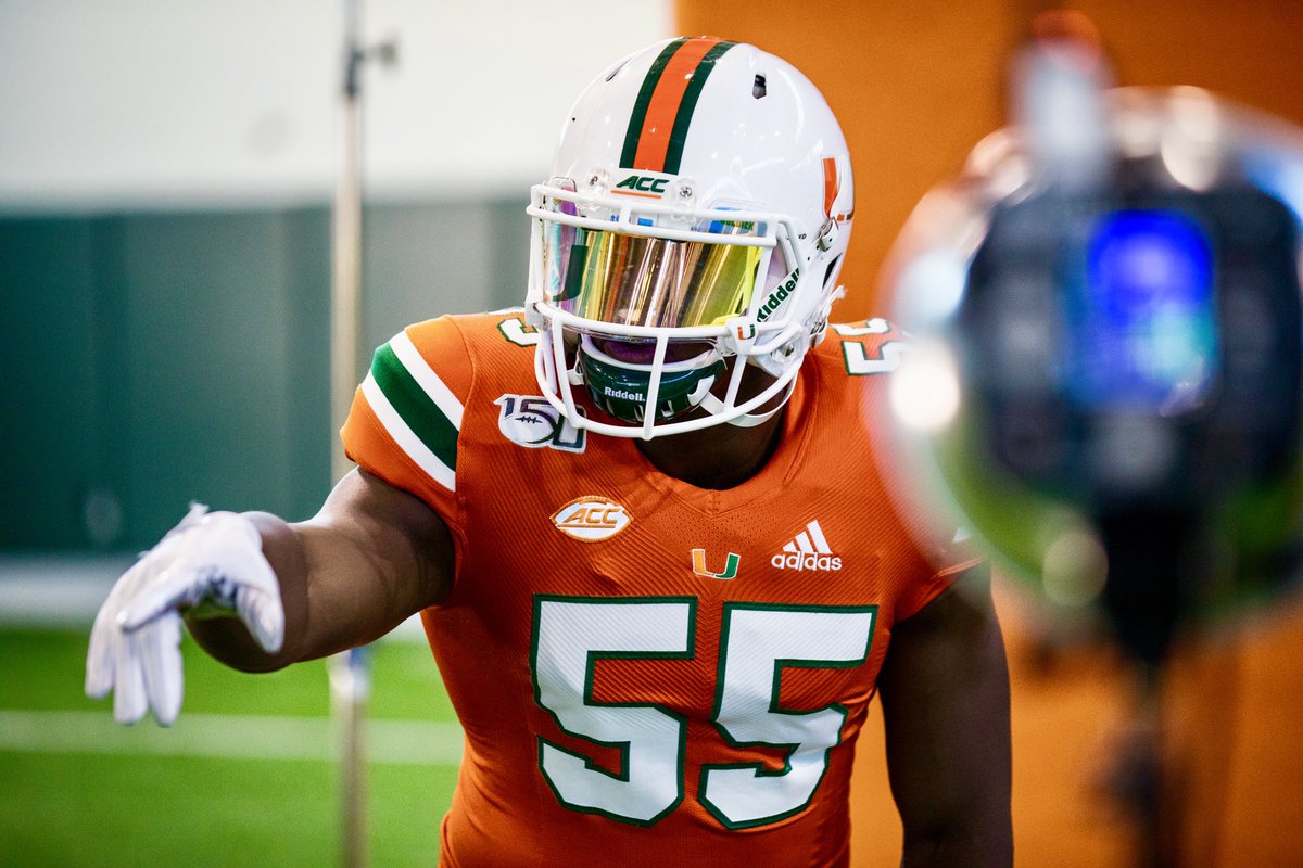
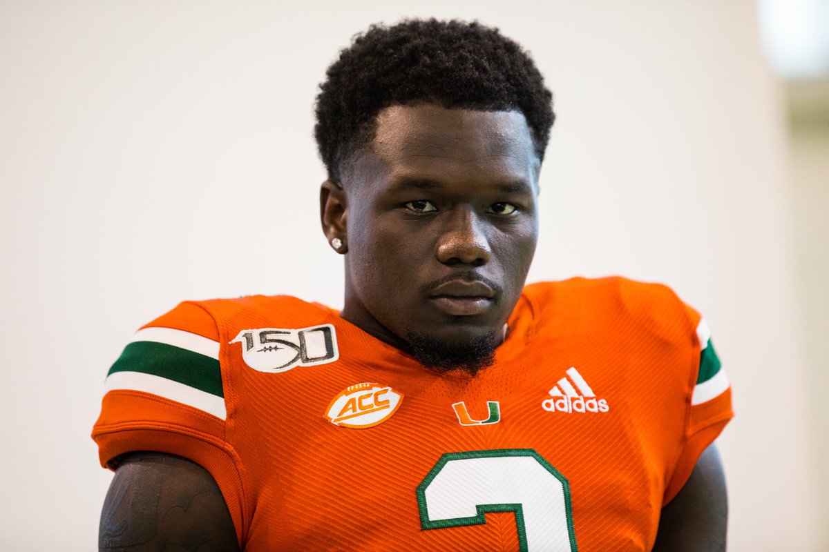
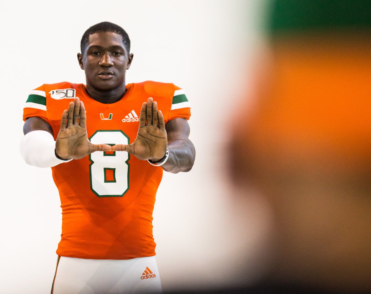
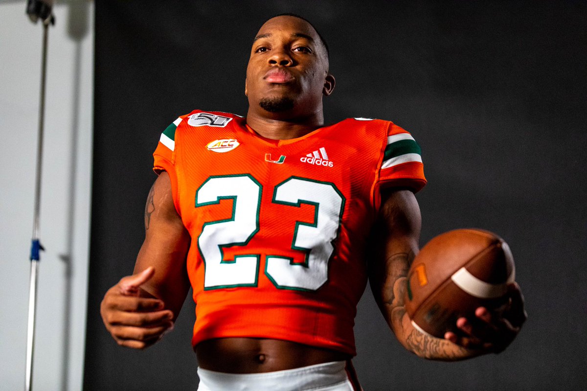
"The U" Logo on the Jerseys

Blake must have got this years uniforms from the same guy he copped his rolly from. "just feel the weight of the watch, you know its real, fell off the back of a truck".

hqdefault.jpg
 
Last edited:
Advertisement
It annoys me every time I see this!! Need the U symbol like the way we had it on our jersey's in 2014
 
Advertisement
Simple fix but it matters for sure. Need to fix those black uniforms too and take that silly *** design off the jerseys
 
U looks distorted and shoulder pads pop out too easily.

Striping on the pants is too thin. They had it right in 2016 & 2017.
 
This is a bad look and diminishes our brand. Somebody needs to get stabbed.


D_M0plQVUAAawc6.jpg


D_M0plPU4AUx0-z.jpg


D_M0plaUcAAaG0m.jpg


D_H93d0UEAA7eGl.jpg
 
Advertisement
I wonder if the 150 yrs of CFB patch will be on all the jerseys for the entire year or if it means we are wearing the orange jerseys for the Florida game.
 
Advertisement
Advertisement
Advertisement
Back
Top