kyle_schick
Redshirt Freshman
- Joined
- Aug 7, 2013
- Messages
- 2,020
What we can decipher from whats been posted on twitter:
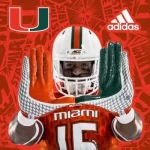
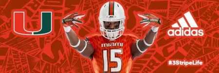
Utilizes the standard Adidas Primeknit as everyone figured.
Notice the green and white color on the SIDE of the shoulders. Adidas has replaced the clam with a pattern similar to what Oregon has on their jerseys.
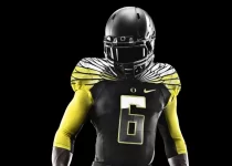
This is also evidenced by Miami commit Tyler Dunning stating in a tweet, "Miami the new Oregon".
Something akin to feathers or what I believe to be palm fronds similar to what we had in the 09 Pro Combat uniform.
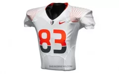
The full shoulder design can be seen in one of the recent AdidasFootballUS tweets.

It appears to be white diagonal stripes with a horizontal green stripe through the middle. I like this a lot. Gives more color to the jersey that the clam didn't last year. Our green tops last year only had an orange beak as a different color.
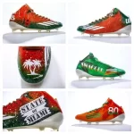
I assess these to be palm fronds because of the early stage propaganda Adidas was pushing out to all the Pro Canes; the cleats. There were palm fronds on almost every pair.
Palm fronds are also heavily represented in the recent AdidasFootballUS tweets.


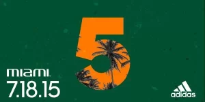
Because of all this, I assess palms will be a large part of alternate uniform designs and apparel/merchandise in the near future.
Because Adidas showed us the shoulder design in one tweet, I assess the pant side design to be in one of the others. A vertical stripe comprised of triangles with the "U" on the hip perhaps? I think it would be pretty cool.
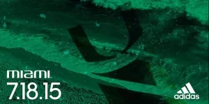
We can see something on the hip in the leaked Adidas uniform brochure as well as the white green white shoulder stripe on the orange jersey. Colors changing on the other two.

I expect at least one alternate helmet too. We technically had four last year. The white, orange, green, and gray. (Gray only seen in two photos, one on Golden's desk, and one of Golden holding it with a recruit. White replaced with the classic white due to a lack of equipment space.) The brochure appears to show an orange facemask. We shall see. I wouldn't be surprised.
I wouldn't be surprised if the Hurricane Warning flags were incorporated somehow into the uniform too.
From what I have been able to put together, I am impressed and pleased. It seems like Adidas actually put some time into it. They are already a step up from what Nike gave us last year and seem to be cool. Of course most people on this website will complain tho.
I do hope for all black cleats, and socks but I know Adidas would never do that. I am excited for the unveil.


Utilizes the standard Adidas Primeknit as everyone figured.
Notice the green and white color on the SIDE of the shoulders. Adidas has replaced the clam with a pattern similar to what Oregon has on their jerseys.

This is also evidenced by Miami commit Tyler Dunning stating in a tweet, "Miami the new Oregon".
Something akin to feathers or what I believe to be palm fronds similar to what we had in the 09 Pro Combat uniform.

The full shoulder design can be seen in one of the recent AdidasFootballUS tweets.

It appears to be white diagonal stripes with a horizontal green stripe through the middle. I like this a lot. Gives more color to the jersey that the clam didn't last year. Our green tops last year only had an orange beak as a different color.
I assess these to be palm fronds because of the early stage propaganda Adidas was pushing out to all the Pro Canes; the cleats. There were palm fronds on almost every pair.

Palm fronds are also heavily represented in the recent AdidasFootballUS tweets.


Because of all this, I assess palms will be a large part of alternate uniform designs and apparel/merchandise in the near future.
Because Adidas showed us the shoulder design in one tweet, I assess the pant side design to be in one of the others. A vertical stripe comprised of triangles with the "U" on the hip perhaps? I think it would be pretty cool.

We can see something on the hip in the leaked Adidas uniform brochure as well as the white green white shoulder stripe on the orange jersey. Colors changing on the other two.

I expect at least one alternate helmet too. We technically had four last year. The white, orange, green, and gray. (Gray only seen in two photos, one on Golden's desk, and one of Golden holding it with a recruit. White replaced with the classic white due to a lack of equipment space.) The brochure appears to show an orange facemask. We shall see. I wouldn't be surprised.
I wouldn't be surprised if the Hurricane Warning flags were incorporated somehow into the uniform too.
From what I have been able to put together, I am impressed and pleased. It seems like Adidas actually put some time into it. They are already a step up from what Nike gave us last year and seem to be cool. Of course most people on this website will complain tho.
I do hope for all black cleats, and socks but I know Adidas would never do that. I am excited for the unveil.