HTownCane71305
All-American
- Joined
- Nov 3, 2011
- Messages
- 14,879
Looks like that leaked card was legit then.
QP is a ******You people would complain no matter what. CanesFam will rep them don't worry!
If the jersey had a swoosh on it, everyone would be going crazy. No swoosh, automatically means trash, lol!
Nah. Honestly, I do like them for the most part even though I prefer Nike as a brand. I think the "Miami" on the front makes an otherwise solid looking jersey look a little cheap, though.
That's one critique I agree with. It's just not a necessary usage of space.
Agree with this for the most part. Nike brand is strong, but frankly I am growing tired of watching them turn every team's uniform into an adaption of the Oregon Ducks. From what we've been shown so far, the new Adidas unis are actually better than I expected them to be.
If the jersey had a swoosh on it, everyone would be going crazy. No swoosh, automatically means trash, lol!
Nah. Honestly, I do like them for the most part even though I prefer Nike as a brand. I think the "Miami" on the front makes an otherwise solid looking jersey look a little cheap, though.
That's one critique I agree with. It's just not a necessary usage of space.

This looks terrible. I mean terrible.
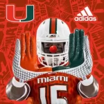
What the **** is up with all this crappy pattern overlay stuff? It's like somebody found the pattern tool in photoshop and decided to add it to BCS 5 time national championship jerseys?!?!
This is just really awful design. Clean lines people. Clean ******* lines. This design is one step away from clown college ****.
Don't believe me? Here.
View attachment 30909
This is ugly. I wouldn't wear this if they paid me to wear this crap, and I know that's what Adidas is doing, but when the $ is more important than actually looking respectable and of quality then we crossed the line from owning our own identity to being an ugly dressup trick for the corporate pimp.
**** this look **** everything about it.
And I will also add that Alabama and USC don't wear stupid alternate jerseys. The reason is they kept their look because their look was important to them. They took pride in their identity. What is our identity anymore? We don't have one. We sold it.
Ask yourselves does Miami make Adidas or does Adidas own miami?
The U is our brand, and we basically let someone run all over it with tire marks.
So you don't like them?
So you don't like them?
No they look stupid, and make my school look stupid and I don't like that. It's more than a jersey. It's trying to change who we are to be something else in order to make other people happy. We won 5 rings without having a clothing company tell us how to look. We don't need to do this, and it makes us look like fools trying to.
This looks terrible. I mean terrible.
What the **** is up with all this crappy pattern overlay stuff? It's like somebody found the pattern tool in photoshop and decided to add it to BCS 5 time national championship jerseys?!?!
This is just really awful design. Clean lines people. Clean ****ing lines. This design is one step away from clown college ****.
Don't believe me? Here.
View attachment 30909
This is ugly. I wouldn't wear this if they paid me to wear this crap, and I know that's what Adidas is doing, but when the $ is more important than actually looking respectable and of quality then we crossed the line from owning our own identity to being an ugly dressup trick for the corporate pimp.
**** this look **** everything about it.
And I will also add that Alabama and USC don't wear stupid alternate jerseys. The reason is they kept their look because their look was important to them. They took pride in their identity. What is our identity anymore? We don't have one. We sold it.
Ask yourselves does Miami make Adidas or does Adidas own miami?
The U is our brand, and we basically let someone run all over it with tire marks.
U want leather helmets too? Or what about that old Miami black and gold? Since we want tradition...
All u Gotta do is root for USC/Alabama then.... USC has been mediocre in nike for a while now. Bama was saved by saban but was mediocre in nike for most of the 90s and early 2000s what exactly is the point.
If this is the U stop pointing to other schools and what they do. Fashion is the last reason we are behind right now.