- Joined
- Sep 18, 2026
- Messages
- 28
Please keep the throwbacks!!!!

2001 vs ND BOOK ITAre you developmentally disabled or something? I had season tickets in 2001. I was at all those games. I loved that 2001 jersey.
But you are conflating my criticism of your fake and inaccurate “inside information” (for which you are infamous) with some mythical dislike of the 2001 jerseys, which I happen to love.
You just aren’t very smart. Or informed.
Nobody cares about you being a season ticket holder in 2001 you want a cookie?Are you developmentally disabled or something? I had season tickets in 2001. I was at all those games. I loved that 2001 jersey.
But you are conflating my criticism of your fake and inaccurate “inside information” (for which you are infamous) with some mythical dislike of the 2001 jerseys, which I happen to love.
You just aren’t very smart. Or informed.
Tell @TheOriginalCane to tell the boosters since he runs the programPlease keep the throwbacks!!!!

2001 vs ND BOOK IT
you're just a hater man.
way more informed then you. that's for sureAre you developmentally disabled or something? I had season tickets in 2001. I was at all those games. I loved that 2001 jersey.
But you are conflating my criticism of your fake and inaccurate “inside information” (for which you are infamous) with some mythical dislike of the 2001 jerseys, which I happen to love.
You just aren’t very smart. Or informed.


Then this thread aint for youI prefer the old school unis but as I've said 100 times, I don't care if they wear pink tutus and Birkenstocks. Just win.
Not sure why this was needed my boyOK, first and foremost, I have to give @AdidasUSFootball their props for recreating an iconic moment. And shoutout to the Canes for allowing us to relive that sense of pride and nostalgia—with the throwback end zones and a classic, old-school Big East ***-whipping of our rivals, Pitt.
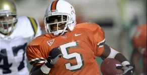
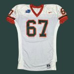
With that said, I’ve been asked about my take on the 2001 jerseys numerous times—in person, on CIS, and across other platforms. My position has always been very specific: the original 2001 uniforms were a Nike design, and no matter how closely Adidas attempted to replicate them, I maintained that the reproductions wouldn’t be an exact match.
Initially, when I saw the uniforms, my first reaction was, “****, am I about to have to eat crow on this one?” At first glance, Adidas appeared to have done a better job than I anticipated.
But then I got a closer look.
And my reaction quickly changed to: “Yep. Exactly what I thought.”
The overall aesthetic might be there, and I can appreciate the effort to recreate such an iconic look; but, reproducing the appearance of a uniform and replicating the original design details are two entirely different things.
So, while @TouchMoney26 was over there celebrating a little too enthusiastically, let’s put the excitement aside for a moment and get into the actual details.
Here’s where the differences become apparent.
1. Collar, Shoulder-Wing Construction & Number Placement -
-Original 2001:
View attachment 377808
Vs.
2001 reimagined:
View attachment 377809
View attachment 377810
The original collar featured green trim confined to the edging and inner seam area, whereas the reimagined version incorporates green throughout the entire collar. That’s a noticeable departure from the original construction.
The shoulder-wing area is another key difference. On the OG Nike jerseys, the wing flowed seamlessly into the surrounding shoulder area, with a smooth, natural curvature. On the Adidas recreations, that same area appears more layered and angular, with a noticeably jagged profile. In essence, the wing takes on the appearance of an exaggerated, expanded “W” rather than the smoother contour of the original.
The wing placement is also significantly higher on the reimagined jerseys than on the OGs, which consequently alters the positioning of the numbers. These aren’t just cosmetic differences; they affect the overall proportions and silhouette of the uniform.
I also noticed inconsistencies in the pants’ fit across the new uniforms. In the photos provided, some players appear to have a baggier fit in certain areas, while others appear to have altered or cut their pants to achieve a more suitable fit. That inconsistency further affects the uniform’s overall presentation.
2. Number Application & Fabric Construction -
You’ll also notice—particularly on Scott’s jersey—that the underlying Adidas fabric or its texture appears to show through the No. 5. That’s a detail you won’t see on the OG Nike jerseys, where the numbers were screen-printed, producing a different finish.
The number application and the way the underlying material interacts with it are important distinctions when comparing the two versions. Nike’s original execution didn’t exhibit the same visible effect in the examples I’m comparing.
I’m also not entirely sure what Adidas is trying to accomplish with its double-row seam construction, but this is an issue I’ve noticed across its newer uniform templates. Whatever the intended construction benefit, the resulting finish is noticeably different from the original Nike execution.
3. Back Construction & Nameplate Area -
-Original 2001
View attachment 377811
Vs.
-2001 Reimagined:
View attachment 377812
Again, we’re talking about subtle differences, but when it comes to design, sometimes the smallest details make the biggest difference. Think Air Force 1s versus BAPE’s Bapestas: one features the Nike Swoosh, while the other substitutes its own star logo. The overall concept may be similar, but the defining details distinguish the two.
That same principle applies here, particularly around the back of the jersey and the nameplate area. This goes back to the shoulder-wing construction I highlighted earlier: Nike’s original design flowed seamlessly into the surrounding material, with a smooth, continuous curvature. Adidas’ reimagined version, by comparison, features a more layered construction that creates a slightly bulkier appearance.
The distinction is in the execution. Nike’s original wing presented as one seamless, integrated piece, whereas Adidas’ version has a more segmented, layered appearance. It may be a subtle difference to the casual observer, but when you’re comparing the original 2001 Nike template against Adidas’ recreation, those details matter.
The goal isn’t simply to reproduce the general appearance of the uniform; it’s to capture the original design’s proportions, contours, and construction. And in this particular area, the two aren’t identical.
Regardless, Adidas’ version is easily the best execution they’ve given us since the start of our partnership, and they deserve their credit for that. Let’s be clear: this isn’t a criticism of the 2001 retros. It’s an acknowledgment of what Adidas did well, while highlighting the subtle but meaningful design and construction differences that distinguish their interpretation from Nike’s original.
Giving Adidas its props doesn’t require me to overlook the details, and recognizing those differences doesn’t make me a Nike homer. The original is the original, and a recreation—no matter how well executed—is still a recreation. Both things can be true.
#GoCanes

Your wayyyy offCurrent uniform is better.
Not sure why this was needed my boy
Its simple. These jerseys are way better then our regular current jerseys
**** yeah brothaIt was needed b/c ppl asked my thoughts, & I’m highlighting the differences; but, u’re 100% correct, these jerseys r better than our current jerseys.