GhostRecon_Cane
When the U is on, there is nothing else like it.
- Joined
- Nov 26, 2014
- Messages
- 2,363
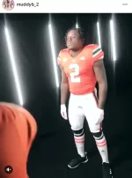
Actually it was our equipment staff that put the U on the collar but it looks great thou
Actually it was our equipment staff that put the U on the collar but it looks great thou
I can only imagine Brock when he first saw the tweet of the U on the Unis
Bandy looks like a coiled cannonball ready to fūck somebody up.
 on the collar will beat the bags full of dollars!
Little CB version of Rohan with that #2Bandy looks like a coiled cannonball ready to fūck somebody up.
Little CB version of Rohan with that #2