GojiraCane
All ACC
- Joined
- Dec 31, 2018
- Messages
- 7,730
What is “The Intangible Sludge”? It’s a phrase recently coined by a film critic to describe the current trend of color grading within film and television, one that wildly alters the color scheme or simply desaturates it almost completely of color.
I first noticed this about a decade ago. David Yates was the director of the last clutch of Harry Potter films, and these productions seemed so lacking in color that at points they were almost black and white. You would see the same again with his Fantastic Beasts films years later. Then in 2016, Rogue One. Everything was grey or brown or yellow. This ultimately became Disney’s de facto mandated cinematography for most of their Star Wars films, the worst being Solo which has heavy color desaturation and is shot so darkly as to be almost unwatchable. The same is true now for House of Dragons.
I am curious if any of you have noticed this? It really, really pops out if view a film that was done before 2007. The trend to play around digitally with colors seemed to kick off then, and movies before were far more vibrant and life like with their colors. An example would be to watch a scene from the first Jurassic Park movie, then watch one from Dominion. Or compare A New Hope to Rise of Skywalker. Or Independence Day (1996) to Independence Day: Resurgence. Or the first Harry Potter movie in 2001 to the last one.
Personally, I miss colors in film. It’s hard not to notice the deliberate removal of colors from film - the Intangible Sludge - once you realize it’s a creative choice.
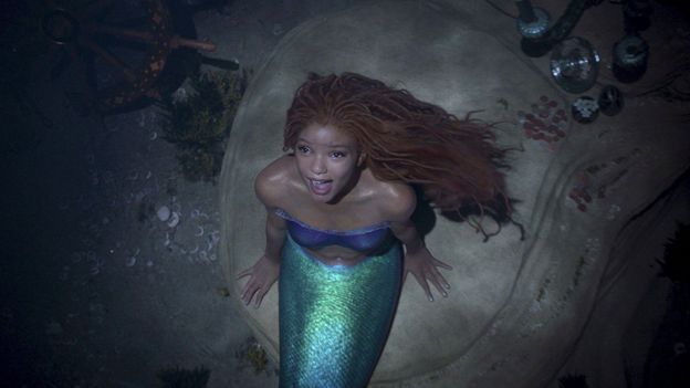
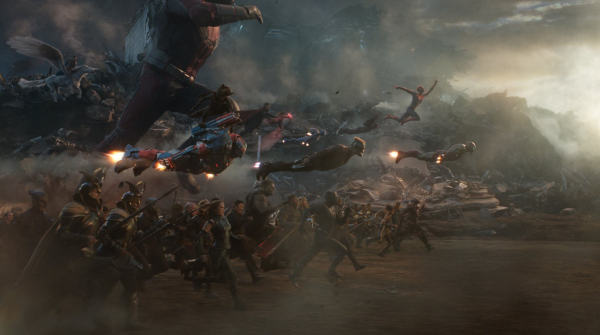
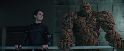
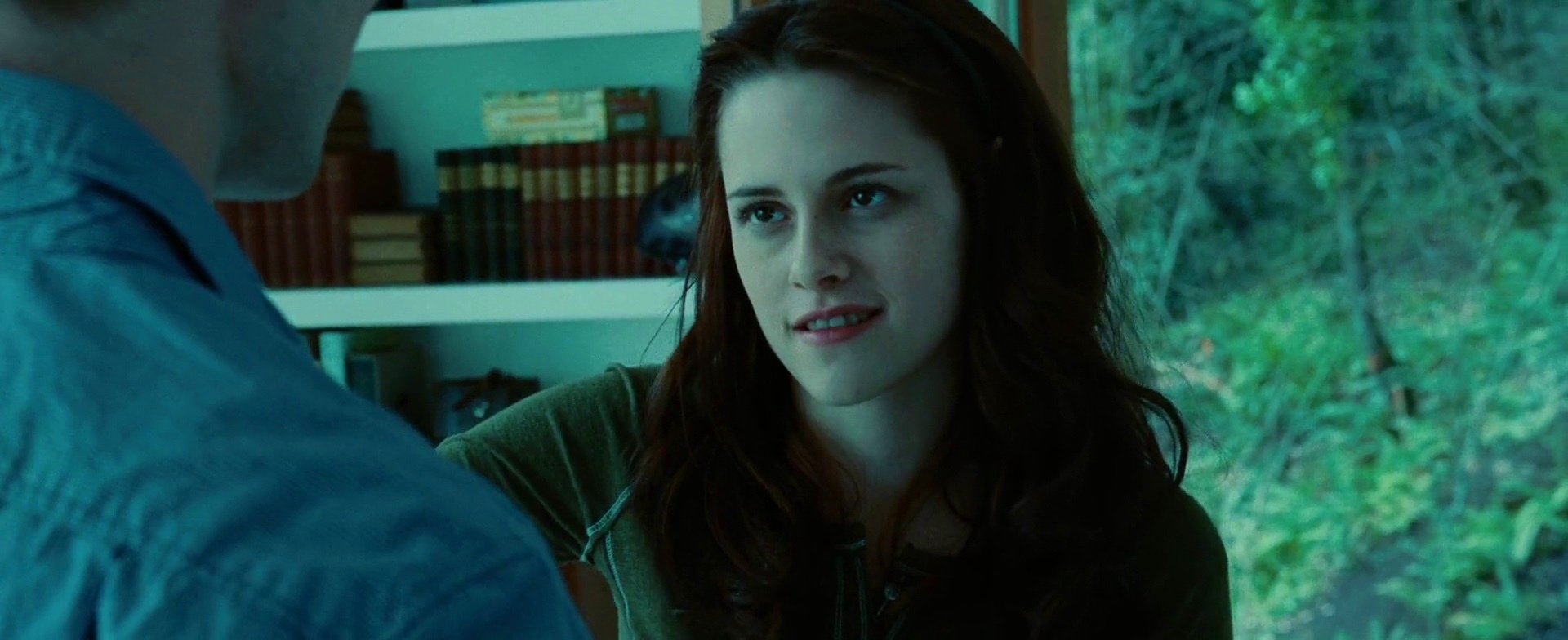
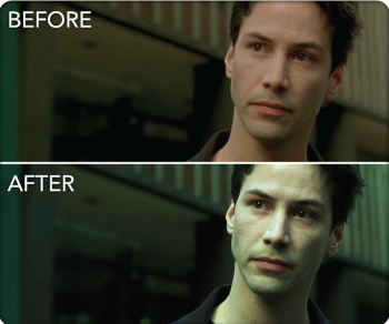
Some examples:


I first noticed this about a decade ago. David Yates was the director of the last clutch of Harry Potter films, and these productions seemed so lacking in color that at points they were almost black and white. You would see the same again with his Fantastic Beasts films years later. Then in 2016, Rogue One. Everything was grey or brown or yellow. This ultimately became Disney’s de facto mandated cinematography for most of their Star Wars films, the worst being Solo which has heavy color desaturation and is shot so darkly as to be almost unwatchable. The same is true now for House of Dragons.
I am curious if any of you have noticed this? It really, really pops out if view a film that was done before 2007. The trend to play around digitally with colors seemed to kick off then, and movies before were far more vibrant and life like with their colors. An example would be to watch a scene from the first Jurassic Park movie, then watch one from Dominion. Or compare A New Hope to Rise of Skywalker. Or Independence Day (1996) to Independence Day: Resurgence. Or the first Harry Potter movie in 2001 to the last one.
Personally, I miss colors in film. It’s hard not to notice the deliberate removal of colors from film - the Intangible Sludge - once you realize it’s a creative choice.
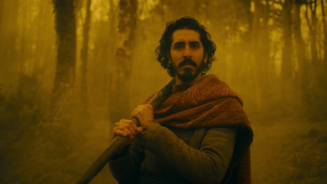
Some examples:
Attachments


Last edited: