forums
You are using an out of date browser. It may not display this or other websites correctly.
You should upgrade or use an alternative browser.
You should upgrade or use an alternative browser.
The Direction Miami Should Go With Adidas Unis
- Thread starter RedPill Stepdad
- Start date
Advertisement
Gatorhater
All-American
- Joined
- May 17, 2013
- Messages
- 17,210
People, kicking everyone *** made the U and our unis cool and known world wide, not the other way around. We have three colors let’s use them, with generous amounts of other teams blood as acent. All this cute crap has brought Oregon how many NC? Can any of you uniform craze guys tell me if we still have the sand pits of the kids to develop their speed? I haven’t been on campus in years. I think we should be concerned why we run more like the Cornhuster team to took our first title from when we run than we do Miami Hurricanes, if you have a uniform that will make us run fast again, I am all it.
Pearson704
Bunker Mentality
- Joined
- Jan 16, 2016
- Messages
- 8,979

Rellyrell
RellyReez is Back Fa Sheez
- Joined
- Dec 19, 2013
- Messages
- 34,761
Our uniforms are good! You let adidas get too crazy and you'll have some ugly ish
Facts. OP must night remember the 2015 joints that caused TVs to crash.
Rellyrell
RellyReez is Back Fa Sheez
- Joined
- Dec 19, 2013
- Messages
- 34,761
All Ohio State which is a "powerhouse program"View attachment 77535View attachment 77538View attachment 77539View attachment 77536
Pic 3 was an updated version of their 1928 throwbacks.
Rellyrell
RellyReez is Back Fa Sheez
- Joined
- Dec 19, 2013
- Messages
- 34,761
Storied football programs have iconic "looks". All of them do. You should be able to look at a teams and know who you're seeing. When you see USC, Alabama, Penn St., Michigan, FSU, UF, etc., etc., etc. you can tell who you're looking at. An identifiable and recognizable look is part of a "brand". And UM is no different. We are a storied program with an inconic look and our uniforms are part and parcel of our "brand".
This is UM's brand. This is our historical and recognizable look. This is how the college football world identifies and recognizes the University of Mimi football team:
View attachment 77545
Now here's what the dip****s at Nike did. There's nothing about this look (or any other that Nike did for us) that was right for UM. The graphics had absolutely zero visual relationship to our recognizable brand identity. Sure, you can take a historical look and update it. But Nike did no such thing. They simply picked a graphic style out of their *** and sent it down to Coral Gables. It literally looks a middle school graphics art class did this. You look at Nike's UM uniforms and you had no idea if you were looking at UM or some other team. Nothing about those unis screamed out "Miami Hurricanes".
And Nike didn't just miss on the graphics. Even the colors were atrocious. UM is located in the most visually tropical parts of the US. Historically, our colors drew from that tropical association; i.e. our colors were bright, vivid, tropical [plant and fruit based, and representative of South Florida. Yet Nike picked colors more appropriate and representative of the the rust belt parts of the mid-west. The orange wasn't tropical, it looked like rust. And the green looked like an industrial cleaning solution or the color of a commercial dumpster, rather than the tropical plant green evocative of SoFl.
View attachment 77552
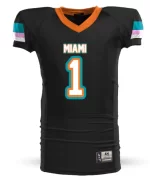
Happily Adidas understands good design principals, respects our brand, and has given us uniforms (after the first year's dumb-*** feathers on the sleeve) that have nailed it. The new graphics of our Adidas uniforms are emblematic and evocative of our historical look, and the colors are bright, vivid and representative of SoFl's tropical color palate. Anyone looking at our Adidas uniforms knows they're looking at the Miami Hurricanes.
View attachment 77555
The bottom line is that Nike saddled us with the worst uniforms in program history. Complete and utter garbage. No way should we entrust those clowns with our uniforms in the future. If Youngstown State ever wants to go orange and green, Nike can just pull our old unis off the shelf. The look would work fine for Youngstown St or some other mid-west program. But they never made proper uniforms for SoFl based UM. The Adidas uniforms strike the correct balance between being modern and fresh, while remaining true to our iconic look and brand.
Slap urself. Our best uniforms were w Nike, are u fckin kidding me? And u wanna talk about colors? How bedazzled is our green now? Orange is bright as fck. The most iconic uniforms are the 2000 joints, what r u talking about? For God’s sake, the first Adidas joints look like some flamingo dance crap w stencil names. Then we got the strawberry patches! The finally got the jerseys right now, and they can’t stay on shoulder pads for chit and the plates and the U on the color is crooked as ****. And guess who introduced The U on the collar?? That’s right, Nike.
Now did Nike create some ugly joints? Absolutely. That lazy *** bra strap design and that FAMU chit was the worst. And guess who introduced us to an aqua FAMU Jersey? Adidas.
As long as Adidas keeps trying to improve and give us money, I’m gucci. That’s a great thing about them, they actually listen.
Rellyrell
RellyReez is Back Fa Sheez
- Joined
- Dec 19, 2013
- Messages
- 34,761
Oh yeah. Let's go back down this road...

Uggggggly as fck!
Advertisement
- Joined
- Sep 29, 2014
- Messages
- 1,536
Please never try again.tried to create a quick version of miami vice uniforms
RedPill Stepdad
graduated from hungry, and made it to greedy.
- Joined
- Jan 1, 2019
- Messages
- 5,853
Pic 3 was an updated version of their 1928 throwbacks.
Keyword: UPDATED
Rellyrell
RellyReez is Back Fa Sheez
- Joined
- Dec 19, 2013
- Messages
- 34,761
Keyword: UPDATED
I’m in favor of updated throw backs as well, honestly.
GhostRecon_Cane
When the U is on, there is nothing else like it.
- Joined
- Nov 26, 2014
- Messages
- 2,370
I'm good with the unis from the Bermuda triangle days.
View attachment 77578
Is it me or did college “kids” look like grown ******* men back then? Sheesh, we had some dayum BEAST.
- Joined
- Jan 6, 2019
- Messages
- 1,942
I know this is a bit off-topic but my major complaint is this: Can we please, for the love of god, stop wearing the goofy white shoes with our uni's and go back to wearing black cleats every week? I don't know how everyone else feels, but I've just always felt like black cleats look tough, and the white style is wack, plain and simple.
Advertisement
FrancisSawyer
All American
- Joined
- Jan 15, 2012
- Messages
- 11,092
Just no feathers or bra straps.
- Joined
- Nov 24, 2017
- Messages
- 1,541
It's real. Those were a different breed. Kids with an axe to grind and a chip on their shoulders.Is it me or did college “kids” look like grown ******* men back then? Sheesh, we had some dayum BEAST.