New Unis !! (We hope)

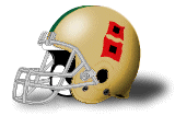
I know people rag on these but I like this uni alot....
View attachment 191675

It’s crazy b/c I forgot who I responded to when they said they would “love to see a Ted Hendricks throw back”, & my reply was bull chit! B/c Nike gave us a Ted Hendricks throw back, which is this picture above, & fans hated it.

I’m legit all for throw backs b/c I respect history. I have several Bears throw back jerseys, b/c I love history. So I’m w/ u, I love these FOR one game. I have zero issues w/ that. I loved UofM & OSU’s throw backs to mark a historical moment in their program’s history, too. If it’s in the archive, I f’s w/ it.
 
Advertisement
I liked that combo, I just hated how the colors of helmet and pants were mismatched.

I want the orange and green helmets back. Doubt it happens.

Yeah, I commented it on them that they should’ve been a matted color. Once I saw the green & rust/burnt orange helmets in the archive, I was fine w/ it, but that metallic finish was not the best for the unis.
 
Nope. That design was the best of the Nike designs, it incorporate the "wave" motif across the shoulders, and it looked great. Just look at how many high school uniforms STILL use this design template. Beautiful and distinctive jerseys.

Call me crazy but I would love to have two versions of uniforms with the waves and traditional stripes with block numbers. Wear them for different games but I assume something like that would be very costly. It’s best of both worlds and caters to all fans.

The good thing with Nike is they have chilled with all the crazy lines and are starting to chill with the new color schemes for schools. Hopefully, our new leadership can be more involved and direct Nike (hopefully MJ) from the branding perspective.

I know Zo wants Nike but I am pretty sure Zo isn’t a fan of Miami not looking like Miami like we have in the past. That’s my biggest beef with these apparel company’s.
 
If u go back to that uniform intro for the 2014 season, that FAMU combo was not on display! Lol Golden mishandled that season & the uniform combinations that yr, & proceeded to obliterate the 2015 season.

Not even the Nike execs knew what horrible uniform mismatching Golden was capable of.
 
Not even the Nike execs knew what horrible uniform mismatching Golden was capable of.

Still up for debate who’s the worst coach in the last 10 yrs, Golden or Diaz. It’s still has to be Golden just based upon outfitting us like the Southside version of FAMU
 
Advertisement
I would love to see us switch to back to Nike. I think Nike just seems to be higher end, both with the player uniforms and fan merch. I would definitely stock up on Nike gear if available.

I think some people are against that because Nike left a bad taste in peoples mouths with the horrible jerseys they gave us over the last 5-10 years of their contract. I might be in the minority, but I really liked the 04-06 uniforms. Thought they looked high quality and most people I know liked them too, I just recently found out through CIS that people didn’t like these. Maybe people dislike that these replaced the awesome 2000-2003 uniforms (I won’t tolerate any slander of these works of art).

The 07-13 jerseys though, my god… those should’ve been burned after the debacle against UVA in the OB’s last game. Not just that, but they were horrible, tacky and cheap looking. And Golden made it worse rocking his horrible all orange combo. The 2014 ones were definitely something different, a lot of people hated them, and while I thought it had some potential, the execution was horrible (thanks again Golden) and it was clear we needed something better.

In comes Adidas and follows that up with the feather jerseys, and if it wasn’t clear that our program was dead by then, these jerseys made sure everyone knew. Thank god Richt got these corrected with the retro look jerseys, which I think have been pretty decent. Even though not perfect (stretched out U on the neck and other quality control issues) I think we can all respect the clean, classic look.

But with the Adidas there just always seems to be something off or missing. We’re about to start playing big boy football again and I would love to see us in Nike gear again, for the players and fans.
Adidas is by far inferior in football when it comes to Nike. Can't wait till we switch back. Those feather jerseys sheeeeeeeeeesh. I like the Nike jersey in 13 with our regular classic white helmet.
 
Would be curious to see how a Nike deal would be reach with the Knight and Cristobal.
 
Would be curious to see how a Nike deal would be reach with the Knight and Cristobal.


Phil cares about money, not whether a coach leaves Oregon. Phil didn't cancel F$U's deal when they hired Taggart.

I don't think this one will be hard to do. If Mario wins 10 regular season games, following an Elite 8 run in hoops and another baseball post-season (yeah, it could have been better), then "2022 Miami" is a HELLUVA lot more attractive than "2015 Miami" was.
 
Advertisement
I don't really care I just hope whatever company we stay with keeps the traditional look we have now, like it or not these are the type of uniforms Miami rose to prominence in and the majority of our hall of famers played in the biggest games played in. This is the uniform people recognize as Miami. When Miami is on like it supposed to be you don't need polk o dots, zebra print, flames and all that extra **** on the unis to draw attention simple and clean works. With that being said if we do stay with adidas I hope they improve the materials on the jerseys because something looks off with the quality and letters.
 

Attachments

  • Screenshot_20220624-153127.png
    Screenshot_20220624-153127.png
    1.9 MB · Views: 41
Everyone has their own opinion and that's fine.

Personally, put in me in the camp who doesn't care if Sketchers does our uniforms so long as we don't ever go back to the Nike look. They broke the cardinal rule of sports team apparel by abandoning our brand.

No one would think of removing the Yankees pinstripes, but for some reason Nike thought it was a good idea to remove our stripes and put us in uniforms that were indistinguishable from Florida A&M, Pompano Ely. Nike maintained the branded look for Bama, UGA, UF, FSU, Mich, OSU, USC, etc., etc. But they ****ed up our uniforms for some reason.

The University of Miami's brand is recognizable by our iconic stripes and "U". Our colors derived from the Orange tree; tropical green leaves, orange fruit, and blossom white. Not only did Nike abandon our stripes, they changed the colors from South Florida tropical to Youngstown rust and Soylent green. Drab, ugly colors. And lastly they tried to change our :neonu: to the dumbass clam.

That's my concern with going back with Nike. I don't trust them to not **** up our look again. In my opinion Nike was the absolute low point in UM uniform history.
 
Advertisement
Everyone has their own opinion and that's fine.

Personally, put in me in the camp who doesn't care if Sketchers does our uniforms so long as we don't ever go back to the Nike look. They broke the cardinal rule of sports team apparel by abandoning our brand.

No one would think of removing the Yankees pinstripes, but for some reason Nike thought it was a good idea to remove our stripes and put us in uniforms that were indistinguishable from Florida A&M, Pompano Ely. Nike maintained the branded look for Bama, UGA, UF, FSU, Mich, OSU, USC, etc., etc. But they ****ed up our uniforms for some reason.

The University of Miami's brand is recognizable by our iconic stripes and "U". Our colors derived from the Orange tree; tropical green leaves, orange fruit, and blossom white. Not only did Nike abandon our stripes, they changed the colors from South Florida tropical to Youngstown rust and Soylent green. Drab, ugly colors. And lastly they tried to change our :neonu: to the dumbass clam.

That's my concern with going back with Nike. I don't trust them to not **** up our look again. In my opinion Nike was the absolute low point in UM uniform history.


I trust Dan.

You didn't see a bunch of ****ty Clemson uniforms over the last decade, did you?

(I mean, beyond the obvious vomit-inducing orange-and-purple colors)...
 
Advertisement
Everyone has their own opinion and that's fine.

Personally, put in me in the camp who doesn't care if Sketchers does our uniforms so long as we don't ever go back to the Nike look. They broke the cardinal rule of sports team apparel by abandoning our brand.

No one would think of removing the Yankees pinstripes, but for some reason Nike thought it was a good idea to remove our stripes and put us in uniforms that were indistinguishable from Florida A&M, Pompano Ely. Nike maintained the branded look for Bama, UGA, UF, FSU, Mich, OSU, USC, etc., etc. But they ****ed up our uniforms for some reason.

The University of Miami's brand is recognizable by our iconic stripes and "U". Our colors derived from the Orange tree; tropical green leaves, orange fruit, and blossom white. Not only did Nike abandon our stripes, they changed the colors from South Florida tropical to Youngstown rust and Soylent green. Drab, ugly colors. And lastly they tried to change our :neonu: to the dumbass clam.

That's my concern with going back with Nike. I don't trust them to not **** up our look again. In my opinion Nike was the absolute low point in UM uniform history.

1. They never tried to change our “U” to a clam. It was the Ibis that was changed, & that design was predicated on a sleek, fast moving ibis. Needless to say it didn’t go over well w/ most & it was changed

2. Again, for the 1002nd time, NIKE DID NOT PUT US IN THE FAMU, POMPANO ELY COMBINATION. That was Al Golden & Al Golden alone who featured this hideous combination.

3. As highlighted by our own archive, Miami doesn’t have a traditional look. They’ve had multiple jersey colors, schemes, combinations well b4 Nike even came on the scene. The 80’s were our longest tenured look, but u can check the archives, we were Oregon before Oregon, my friend. I know that’s a hard concept to swallow, but that’s why important to check history vs. nostalgia.

4. With that being said, keeping it simple for 90% of the season is alright by me, but I would not mind seeing an alternate or a throw back. If u notice, most of the kids love rocking the black unis & those r definitely not in our history.
 
1. They never tried to change our “U” to a clam. It was the Ibis that was changed, & that design was predicated on a sleek, fast moving ibis. Needless to say it didn’t go over well w/ most & it was changed


I would also add, Nike did not want to continue paying royalties to John Routh to use the existing Sebastian the Ibis logo.

It was a bad idea all around.
 
Advertisement
Back
Top