TouchMoney26
Presidente del U
- Joined
- Jul 25, 2018
- Messages
- 2,563
Our unis would be so much better if we just fixed the collar simular to theseThose were too clean.
Our unis would be so much better if we just fixed the collar simular to theseThose were too clean.
I AGREE 100%
not to mention, why do you think Nike is so big with apparel, and all the color-ways in sneakers etc. Aesthetics and apparel is part of the game. It has a lane. Why do we go through this circle every time. It's not the most important factor, but it factors in. Fans like many details about a team or program. Just respect it, even if its not for you, thats cool, but stop with the negativity and hating. **** gets so old.How the **** is it weird? We are buying the jerseys. We buy the merchandise. The players want to look good in their uniforms. Look at how hyped the players get when they get the Jordan sponsor.
Looks like the green is darker
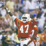
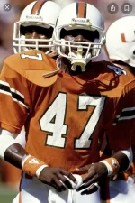
The Greens are my favorites.These green are my all time fav canes jerseys. **** the dam fiesta bowl these were fresh
@Hurracanes you don't look well. LOLThe Greens are my favorites.
It’s the camera. Those uniforms are from last season. Lol.
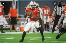
Just don’t turn the Orange shade into the Nike shade. I love our current shade closer to the Russell Athletics.
IMO, Adidas orange is closer to the old Russell Orange than the Nike Orange (which was lighter and dull, imo). It didn’t have that Russell, pop. Adidas ain’t quite there either.
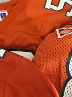
I literally have game used jerseys from Russell and Nike and they are not close. RA is a darker shade. Adidas is closer to that shade than Nike was. This isn’t based on opinion.This orange is horrible, r u kidding me. Lol
Adidas has a highlighter tone of Orange, not remotely close to Russell. Nike took on the complete template. There’s a clear & obvious hue difference in color from Russell/Nike vs. Adidas. Just like it was a clear hue difference from Michigan Nike vs. Adidas.
Yea they did. I wouldn’t like it to be a change going forward, as I’m partial to the white face mask. But for a home game or 2…. I would be down with that.Man I just want gray face mask. They looked great the night they honored coach Schnellenberger
This is facts. Nike was closer to Tennessee Orange than the Russell’s.IMO, Adidas orange is closer to the old Russell Orange than the Nike Orange (which was lighter and dull). It didn’t have that Russell, pop. Adidas ain’t quite there either.
I literally have game used jerseys from Russell and Nike and they are not close. RA is a darker shade. Adidas is closer to that shade than Nike was. This isn’t based on opinion.
You guys don’t understand the concept of cameras and how the resolution alters colors.
I’ve literally held the jerseys side by side & I totally disagree. The earlier Nike jerseys were closer to Russell, & became darker over time. Adidas looks more highlight orange & the green fa sho has shimmer tint.
I did bruh. The lighting is different on all of them pics. The first adidas pic looks darker than the Nike jerseys (in person) to me. I have (had) both. The 1st Irvin (Russell) jersey even looks different from the 2nd one cause of the sun light. We’re talking semantics here, but the bottom line is, neither jersey has had the exact Russell color. Adidas has done a good job recreating our iconic look, and even taken a similar “Miami” font that was “borrowed” from Nike.See above, my brotha.