forums
You are using an out of date browser. It may not display this or other websites correctly.
You should upgrade or use an alternative browser.
You should upgrade or use an alternative browser.
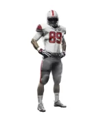
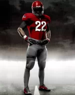
NEW UNI SNEAK PEEK
- Thread starter snowmoney
- Start date
Advertisement
Cane Dynasty
Thunderdome Survivor
- Joined
- Feb 27, 2013
- Messages
- 19,983
These schits is ugly as Hope Solo's ****** lips.
Dingaan1828
Miss my dog
- Joined
- Dec 31, 2011
- Messages
- 5,916
Put me in the "I like em" column.
Just win.
Just win.
- Joined
- Jan 30, 2012
- Messages
- 45,143
These schits is ugly as Hope Solo's ****** lips.
Whoa, pump the brakes. You went too far.
CaneFan79
Senior
- Joined
- Dec 29, 2013
- Messages
- 4,971
These schits is ugly as Hope Solo's ****** lips.
Watch it, she can come kill you and won't get suspended a minute!
Dwinstitles
All-American
- Joined
- Nov 7, 2011
- Messages
- 54,850
Asked da wifey we young heads, she said last years were more miami and this year kids won't like these. I agree nikes was jus bad ***, when Nike makes a clam look hot they kno what there doing.
I have to see these on game day might change my mind but these shyts look like Adidas and that's not a good thing.
I have to see these on game day might change my mind but these shyts look like Adidas and that's not a good thing.
hoops156
Senior
- Joined
- Dec 4, 2011
- Messages
- 31,021
Asked da wifey we young heads, she said last years were more miami and this year kids won't like these. I agree nikes was jus bad ***, when Nike makes a clam look hot they kno what there doing.
I have to see these on game day might change my mind but these shyts look like Adidas and that's not a good thing.
last years uniforms were the worst things to ever come out of oregon
Advertisement
- Joined
- Jan 13, 2013
- Messages
- 2,299
BWCD
Junior
- Joined
- Jul 24, 2012
- Messages
- 2,978
- Joined
- Nov 2, 2011
- Messages
- 25,337
Anyone that praises Nike after the dog**** they've given us really needs to check his reality. They've been making a joke out of our unis for a decade.
They screwed up FSU so royally that they had to change the facemask and helmet colors back to the 2013 versions. They changed the color of the road numerals that were originally gold back to maroon. All of that happened in-season.
The interlocking spears on the helmet that they introduced have been changed back to the previous version as well. The only thing left is the new logo and ugly those symbols on the collar and shoulders.
This. Nike made FSU's unis look like BC.
My biggest concern with our unis is that they will be closer to a reddish hue than the traditional orange.
I also hate that cot dang clam legacy "Miami" font.
plantcity3
Senior
- Joined
- Jun 16, 2014
- Messages
- 7,907
Yall sleep. I like the orange on green combo.....
DuffleBagYoda
TBayCane RELOADED
- Joined
- Dec 5, 2013
- Messages
- 2,013
Them b*****s hard. If the Miami disappeared from over the numbers i wouldn't even trip
I'm james Jackson brother
Senior
- Joined
- Nov 2, 2011
- Messages
- 2,841
The uniforms are ok everything else is jacked up
Advertisement
DuffleBagYoda
TBayCane RELOADED
- Joined
- Dec 5, 2013
- Messages
- 2,013
Jerseys are fine. I have a hard time understanding why anybody really hates them. It's a pretty clean look. The white uni with any color of pants looks legit. The green/orange combo is terrible. The only reason the the orange jersey/green pants worked last year is because the orange jerseys had a decent amount of green and it blended nicely
I can't stand all black especially for teams whose colors aren't black. Dark green and black is a bad color combo. if you must have alternative and you want black, why not come up with a black and red uni with real hurricane flags? I will get killed for this: but why not turn the U black and red or even stick hurricane flags on the helmet and put the U on the jersey or something. That would be a real alternative uniform and it's relevant to the nickname of the school.
Tulsa has hurricane warning flags.....
Why not just an actual storm
BWCD
Junior
- Joined
- Jul 24, 2012
- Messages
- 2,978
I like that it's darker. Living up here in the western part of VA, just a few hours north of Knoxville, and in the midst of Chokie country, I like that our orange can be differentiated from those two programs' orange.My biggest concern with our unis is that they will be closer to a reddish hue than the traditional orange.
Also--even with our older unis...when our orange is "our orange", it turns a darker shade in the rain and has some reddish hue to it. It makes sense, and doesn't really look all that bad at all.
I have only 2 gripes about the uniforms:
1) I think the "U" on the hip of the pants gets stretched vertically, and looks weird. It's looked odd on just about every picture I've seen so far. Looks like someone took the middle of the "U" and pulled it down just a little.
2) I think the Adidas logo on the pants should have been on the back at the top of the tailbone instead of the hip, because it ****-near hits the "U" logo on the side. Either move it, or leave it off the pants altogether.
I don't really have any complaints other than that.
Rellyrell
RellyReez is Back Fa Sheez
- Joined
- Dec 19, 2013
- Messages
- 34,767
Yep.^ Photoshopped, not real.
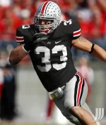
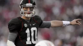
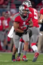
BUT - tOSU* has had wacky alternate unis. Remember these?
View attachment 30943
View attachment 30944
View attachment 30945
you mean their throw back unis???Tthe top one is a version of their 1928 uniforms, the middle one is a version of their 1973 uniforms, and the 1939 uniforms.
