Canedude08
Sophomore
- Joined
- Dec 27, 2014
- Messages
- 6,845
My feet hurt just looking at them. Seriously.So this is for people without toes?
Those jerseys will sell. The shoes aren't really my jam, but I want one of those jerseys for the archives.
My feet hurt just looking at them. Seriously.So this is for people without toes?
Those jerseys will sell. The shoes aren't really my jam, but I want one of those jerseys for the archives.
That looks terrible. I don’t understand how our basketball program have the ****tiest designs compared to Football and Baseball.I told some of the homies in another thread Jerry is a Ye protégé. He’s a former Nike designer; I was excited about this, but the supposed delay was he wanted to perfect his athletic brand…going to be honest, this a bit underwhelming knowing his work. However, just for clout purposes, I’ll take it.
Tell me you haven't been paying attention without telling me. Adidas has given the basketball team some mediocre designs mixed in over the years(The trolley yellow uniforms, I couldn't even look at them without asking questions), but considering how many different templates the programs have gotten, it's been a pretty small number of duds mixed in. Without a doubt, the baseball program has had the best Adidas experience, then again, they have such a rich history of throwbacks and whatnot, it would take a complete idiot to mess up those designs. Football, outside of the first template has kept it extremely simple, relying on the tried and true template that most of us are familiar with, with some timely updates and tweaks to fix issues.That looks terrible. I don’t understand how our basketball program have the ****tiest designs compared to Football and Baseball.
Tell me you haven't been paying attention without telling me. Adidas has given the basketball team some mediocre designs mixed in over the years(The trolley yellow uniforms, I couldn't even look at them without asking questions), but considering how many different templates the programs have gotten, it's been a pretty small number of duds mixed in. Without a doubt, the baseball program has had the best Adidas experience, then again, they have such a rich history of throwbacks and whatnot, it would take a complete idiot to mess up those designs. Football, outside of the first template has kept it extremely simple, relying on the tried and true template that most of us are familiar with, with some timely updates and tweaks to fix issues.
Basketball on the other hand, has been the place where Adidas has done the most experimentation and whatnot, and honestly, it's a welcome change from what we saw before. Keep in mind, Nike did very little with the basketball program, they gave us a standard template, we had our four uniform color combos(white, green, orange and black) and it didn't change for years on end. It was what it was. Adidas gives us different alternate looks every year, and honestly, they've been unafraid to try things that on their face sound weird, but turn out better than anticipated. I remember when the white "Ibis" alternates first hit, people were like "What's up with the feathers", now people look at those as a solid design. The paintbrush black alternates, same concept. The reverse retro series was really popular, honestly they should have likely kept the ones from the Elite 8 year and made them the secondary alternates, to where Miami had 8 different uniform templates, plus the one offs. That would have been cool, and I'm quite sure that template would have sold like gangbusters in regards to jerseys, sweatshirts and the like. I still believe that by not widely releasing the player exclusive retro sweatshirt, Adidas missed a great opportunity.
We also have to realize an important thing: A lot of this stuff isn't designed for us old farts anymore, and we need to stop expecting it to be. I've been fortunate enough to talk to younger people both inside and outside of Miami, and it's amazing how they feel about some of this stuff. Due to my client base and where my office is located, I get to talk to ASU kids somewhat regularly. I have had people, once they find out that I'm a Miami alum, note that "You guys get all the good collabs", even for stuff that I don't think is all that cool. The entire "Fear of God" series isn't really my jam, but I'm quite sure that a guy in his late thirties isn't the target demo.
I'm willing to bet that if you polled the fanbase, there would be a generational divide in regards to the Adidas era. Again, the Nike era coincided with most of us old farts being the target demographic, hence why a lot of people rock with it. A classic example of this would be our replica basketball shorts. I'm a hooper, i'm quite sure I have at least one pair of every single short we've released for retail since 2004. Once we moved over to Adidas, I started noticing that the shorts just weren't the same. Then it finally made sense: The way I wear my shorts and the way Adidas designs shorts for the modern athlete are completely different. Look at how kids wear their shorts now, and for the last decade, compared to when most of us old farts were coming up. Shorts are shorter, they aren't nearly as baggy and as a result, the design elements reflect that. If you were to take our current main shorts and make them for someone like me, it would look silly, but if they are cut to where the typical student athlete wants them, the design makes sense.
I understand and agree with a lot of what you say on how "the kids" look at these things. Yes, we "older folks" have our likes and dislikes, and it may not mesh with how the younger folks see things.
So I'm going to focus on a couple of things.
First, you keep slamming Nike (you've been doing it for years) because of the basketball uniforms, and I'm not sure what you're talking about with the "white ibis alternates with feathers", as you might be mixing and matching football and basketball.
Having said that, Nike was VERY creative on the football side. Introduced "smoke" (gray), which was a huge hit. Some of their design elements didn't work, but they were changing our football uniforms every few years, as well as integrating some one-off elements, several of which didn't work out so great either (but MIGHT have been impacted by us LOSING GAMES while wearing those uniforms).
So, sure, maybe Nike wasn't as innovative with hoops uniforms as with football uniforms, but with adidas it has been a complete flip. Outside of the disastrous initial football jerseys, adidas has given the football team pretty much the same thing for nearly a decade.
Now, as to your issue with the basketball one-offs, I will say this. EVEN BEFORE IT WAS EXPLAINED (the "Coral Gables trolley" connection), I hated the yellow jerseys. They were horrendous, and I don't even think you will find any of "the kids" who like them. The "connection" was something that might have appealed to "old farts" if it had been explained in advance, but I seriously doubt "the kids" are going crazy to rock a colorway that pays tribute to the **** Coral Gables trolley.
I haven't been impressed with adidas on the hoops side. The shoes (outside of the UltraBoosts) have been terrible. The women's jerseys are just fugly. The men's jerseys are fine, and it's the ONE TIME that the U on the V-neck actually works out well. I'm not sure why you seem to be down on "orange/white/green/black", those are our colors (well, not black), so I shouldn't feel bad about the "boring" use of my school's colors.
adidas has, on the whole, NOT been good for UM apparel, either financially or stylistically. That's just a fact. Some of it is, perhaps, unavoidable as the "distant second place choice" among athletes.
Sorry.

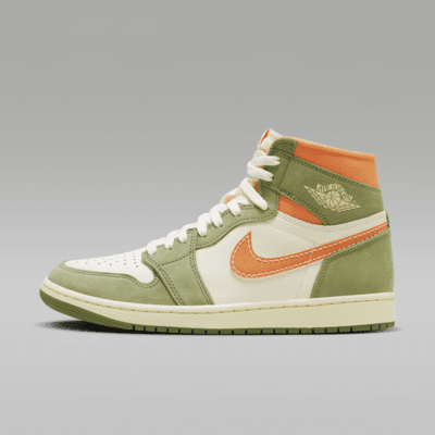
Idk how these flew under my radar so long but I couldn’t get my wallet out fast enough View attachment 282822
link for purchase?Idk how these flew under my radar so long but I couldn’t get my wallet out fast enough View attachment 282822
Where did you get the hoodie? I'm out of town so the team store is not an option unless they put it online. I've been checking and haven't seen themJust bought the hoodie.
Will try to buy the shoes on the website.
link for purchase?
can you post a picture of the hoodie?Just bought the hoodie.
Will try to buy the shoes on the website.
Just bought the hoodie.
Will try to buy the shoes on the website.
And some of you wearing it as well. Maybe some action shots would be a nice touch.can you post a picture of the hoodie?
And some of you wearing it as well. Maybe some action shots would be a nice touch.
