forums
You are using an out of date browser. It may not display this or other websites correctly.
You should upgrade or use an alternative browser.
You should upgrade or use an alternative browser.
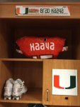
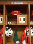
Names on the Back of the jerseys have the Miami font
- Thread starter fincane
- Start date
More options
Who Replied?
Advertisement
Looks good. Can't wait to see then in action.. Optimism slowly starting to build. #beatbethune .
Rdcane
Thunderdome
- Joined
- Sep 17, 2013
- Messages
- 530
I can't help it manLooks good. Can't wait to see then in action.. Optimism slowly starting to build. #beatbethune .
View attachment 31617
it's like when my friends try to set me up with good girls but i keep chasing the crazy ones. Some of us just have the memory of a gold fish and higher tolerance for pain. #dale
Advertisement
Stingarov
GOATaylor
- Joined
- Dec 5, 2012
- Messages
- 3,082
ugly.
and when are we gonna wear orange on white again? i hate the orange on orange look.
agreed. Awful.
Cane[]_[]DigIt
It's all about the []_[]
- Joined
- Feb 13, 2012
- Messages
- 458
I hope these look better in action... I may be in the minority but I don't care for these at all.
we never wore that orange on orange till this staff took over. That **** aint Miami
We never had green pants till 2000. That wasn't Miami. So your boy allowed Nike to phase out Orange and bring the clam on board. But he won right? So not a big deal.
Advertisement
B.B.B
Oh wait.....
- Joined
- Aug 24, 2015
- Messages
- 869
we never wore that orange on orange till this staff took over. That **** aint Miami
We never had green pants till 2000. That wasn't Miami. So your boy allowed Nike to phase out Orange and bring the clam on board. But he won right? So not a big deal.
yup, winning kinda makes a big difference.
I associate winning to combos we wore when we were..... winning, and orange/orange to us sucking balls...
Advertisement
Klamalama
Board Ban Under CIS Martial Law Until 11/5/20
- Joined
- Jan 19, 2012
- Messages
- 6,019
Last night I saw the Blue Hens' new Adidas uniforms. They had nearly unreadable numbers. Many complained.
The mixing of upper and lower case is an aBomINaTIoN. I can understand it as a logo

because you are only dealing with a few characters.
Now the uniform has been reduced to some kewl teen hacker underground web site. All things considered, it's no wonder some call the company ah-di-da.
So, who was the MORON in the AD office that bought into this CRAP?
By the way, that is NOT the school font. This new unreadable mess has narrower characters. Guarantee that, in the near future, some pundit will connect the unreadable font with the team's ineptness.
The mixing of upper and lower case is an aBomINaTIoN. I can understand it as a logo

because you are only dealing with a few characters.
Now the uniform has been reduced to some kewl teen hacker underground web site. All things considered, it's no wonder some call the company ah-di-da.
So, who was the MORON in the AD office that bought into this CRAP?
By the way, that is NOT the school font. This new unreadable mess has narrower characters. Guarantee that, in the near future, some pundit will connect the unreadable font with the team's ineptness.
Last edited:
Stingarov
GOATaylor
- Joined
- Dec 5, 2012
- Messages
- 3,082
ugly as fk...kaaya name look like its spelled in russian
those a's aren't too great, I agree. Whatever though. Just win.
Advertisement
brock
All-American
- Joined
- Dec 4, 2011
- Messages
- 39,527
come on man,lmao with that quote at the bottomugly as fk...kaaya name look like its spelled in russian
those a's aren't too great, I agree. Whatever though. Just win.
77cane
Junior
- Joined
- Jan 28, 2012
- Messages
- 1,830
we never wore that orange on orange till this staff took over. That **** aint Miami
We look like creamsiicles with the all orange.
Advertisement
