kyle_schick
Redshirt Freshman
- Joined
- Aug 7, 2013
- Messages
- 1,963
I really hope that the new Adidas Miami Hurricanes uniform set being unveiled soon is of much better quality than the current set. There are multiple different things I've had issues with that many people don't seem to realize, and has never been an issue on a Nike or Under Armor team. Adidas remedied some of these problems, and has let some continue into this year. Before i begin, know that this isn't going to be complaining about the design, and whether or not I like it, but a breakdown of issues that are completely unacceptable for a major brand like Adidas.
Issue 1. The Hurricane Stripes
Starting at the unveiling at Club Liv last year, the shoulder stripes, and pant stripes have been printed backwards many times.
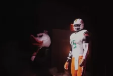
On this left side of this mannequin, the stripes are correct.
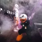
On the right side of that same mannequin, the pant stripe is backwards. At the official unveiling.
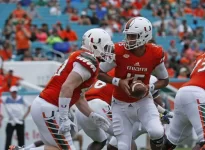
Here is Gage Batten, a fullback, with his shoulder stripes going backwards.
How can Adidas push these uniforms to Miami without checking them for these blatant production errors? Unacceptable.
Issue 2. Name Plate Issues
We all remember last year how the font used for the name plates on the back of the jerseys looked terrible. Adidas was trying to achieve a unique look in college football by using the signature Miami font for the players last names. In theory, a good idea, but their execution was disgusting.
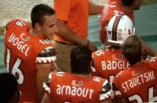
This attempt at replicating the signature Miami lettering resulted in last names being literally, almost unreadable.
What I still cannot fathom is how a major international company like Adidas can screen the word MIAMI on the front of the jersey in the correct font, and use a completely different, awful looking version of it on the back--of the same article of clothing!? There's no excuse for this. A simple google search will find the words MIAMI and HURRICANES in the official trademarked font. Why couldn't Adidas figure out the remaining 16 letters?
Mid-season, Athletic Director Blake James announced that they were returning to the traditional block lettering, which ended up looking much better.
But the issues aren't over here.
Following our victory over Appalachian State today, i noticed that Chris Herndon's name is spelled wrong on his uniform.
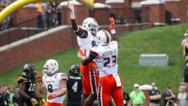
Once again, no quality control. It only takes one person, a few minutes to go through a pile of jerseys and make sure names are spelled correctly.
Issue 3. Corn Elder Wearing the Wrong Number
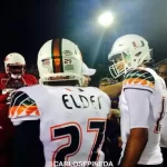
Last year, cornerback Corn Elder wore the number 27 against FAU. I believe the University acknowledged the problem, and solved it mid-season but its still another simple quality control issue that should never have happened.
Issue 4. Green Socks Appeared Blue
Its hard to prove this in a narrative but go back and watch the highlights, or replay of the games wear we wore the green accented socks last year. On TV, they appeared blue.
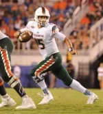
Blue is not a University of Miami color. A simple TV test of the uniforms would have discovered that they don't look green when viewed on screen, but again, this is apparently too much for Adidas.
I could continue but I think my point is made. Adidas has claimed that The University of Miami is supposedly their flagship school similar to Oregon with Nike but they have haven't shown it. They've demonstrated an ambitious yet amateurish, and disrespectful pattern of behavior with their continued lack in quality.
Issue 1. The Hurricane Stripes
Starting at the unveiling at Club Liv last year, the shoulder stripes, and pant stripes have been printed backwards many times.

On this left side of this mannequin, the stripes are correct.

On the right side of that same mannequin, the pant stripe is backwards. At the official unveiling.

Here is Gage Batten, a fullback, with his shoulder stripes going backwards.
How can Adidas push these uniforms to Miami without checking them for these blatant production errors? Unacceptable.
Issue 2. Name Plate Issues
We all remember last year how the font used for the name plates on the back of the jerseys looked terrible. Adidas was trying to achieve a unique look in college football by using the signature Miami font for the players last names. In theory, a good idea, but their execution was disgusting.

This attempt at replicating the signature Miami lettering resulted in last names being literally, almost unreadable.
What I still cannot fathom is how a major international company like Adidas can screen the word MIAMI on the front of the jersey in the correct font, and use a completely different, awful looking version of it on the back--of the same article of clothing!? There's no excuse for this. A simple google search will find the words MIAMI and HURRICANES in the official trademarked font. Why couldn't Adidas figure out the remaining 16 letters?
Mid-season, Athletic Director Blake James announced that they were returning to the traditional block lettering, which ended up looking much better.
But the issues aren't over here.
Following our victory over Appalachian State today, i noticed that Chris Herndon's name is spelled wrong on his uniform.

Once again, no quality control. It only takes one person, a few minutes to go through a pile of jerseys and make sure names are spelled correctly.
Issue 3. Corn Elder Wearing the Wrong Number

Last year, cornerback Corn Elder wore the number 27 against FAU. I believe the University acknowledged the problem, and solved it mid-season but its still another simple quality control issue that should never have happened.
Issue 4. Green Socks Appeared Blue
Its hard to prove this in a narrative but go back and watch the highlights, or replay of the games wear we wore the green accented socks last year. On TV, they appeared blue.

Blue is not a University of Miami color. A simple TV test of the uniforms would have discovered that they don't look green when viewed on screen, but again, this is apparently too much for Adidas.
I could continue but I think my point is made. Adidas has claimed that The University of Miami is supposedly their flagship school similar to Oregon with Nike but they have haven't shown it. They've demonstrated an ambitious yet amateurish, and disrespectful pattern of behavior with their continued lack in quality.
