Bad News For The Tire Marks Uni Haters

Advertisement
Looks pretty good to me. Much more simple design.
 
Advertisement
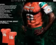
This image is old so I am not sure how accurate it is. Additionally, Adidas really is amateur hour sometimes. First of all, the stripes on the jersey on the guy is totally different than the stripes on the jersey sample below. How can a business like Adidas make that mistake? Last year, they made a huge error on the White jerseys with the stripes as well.
 
Miami.webp
 
I'm assuming the Orange 16 Uniform towards the bottom of the ad are the actual game day jerseys and not the painting of the guy with the #15 odd colored getup. The #16 Jersey looks perfect to me. Nothing fancy, just some basic stripes on the sleeves and the Miami script lettering. I like them.:monkey-serious:
 
Advertisement
Looks like U is on the cover and fit page... more credence to the folks saying we'd be Adidas 'Oregon' moving forward.
 
Whats with their triangle like shape fabric? Very soccerish and I am not a fan.

that's their patented technology. This may not be the final look, because they moved the logo to the side on practice jerseys. I expect the same on the unis, but they are a lot better than before. this is a start in the right direction. I hope we can get bought out by Nike after we start winning because adidas is lacking.
 

they don't know what to do.. I like the green pants with the stripes and the orange jersey but without that green neckline. They are all over the map with our look and not in a good way. These guys need help. A lot of this stuff shouldn't see the light of day.. this is like that weird **** you see on the runway that nobody actually wears in real life.
 
Back
Top